![]()
![]()
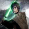
Today we present a special video showcase of some of the new unit and hero models that we've created for Age of the Ring. Unit art is what we spend a lot of time on trying to get just right. Whether we base it off of existing Weta concepts, come up with our own design, or employ a mix of both: each unit is extensively researched and discussed amongst our 'art department', consisting of RiderOfRohan, Dúnedain76, and Mathijs.
![]()
The main things we take into account when designing a unit are style, silhouette, and, most importantly, coloring and contrast. It's become a bit of a meme inside of Skype calls - "make it contrasty."
When designing an original unit, such as the Lothlórien's Nandor Hîr-Hathol unit or Gondor's Linhir Spearmen (both featured in the video above) we look for historical references to base our work on, so everything stays within that grounded fantasy Weta created for Lord of the Rings. Once we have the style locked down, we move onto doing the actual model.
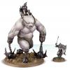
Silhouette. It's easy to take a generic human male soldier model and just retexture it for everything we need (maybe shrink it a little for when we're doing a dwarf), but the result is that everything will sort of start to blend together ingame. To prevent this, we spend most of our time on each unit creating its 3d shape: one soldier may have big mail sleeves, another may wear a leather doublet, maybe an overcoat or tabard, so we take our time highlighting these features in the mesh, so that each type of soldier has its own distinctive shape, which is then further emphasized when we start on the texture.
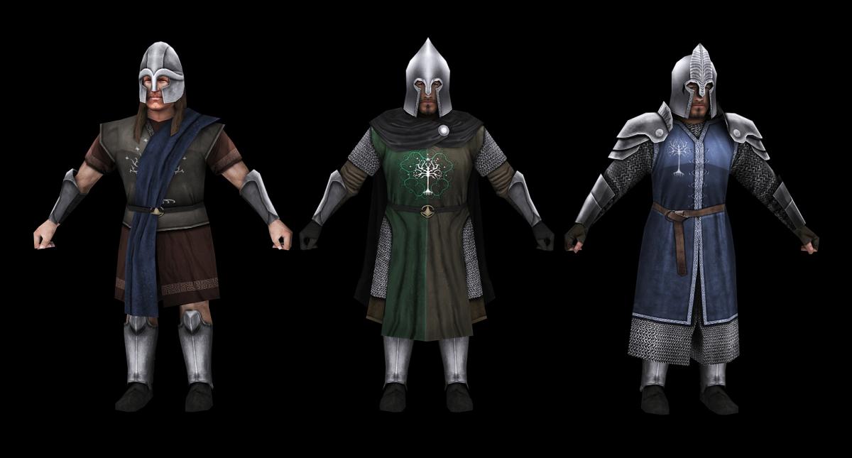
Example of different silhouettes in similar units: each Fiefdom unit above has a distinctive helmet and other mesh features. Models are WORK IN PROGRESS.
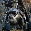
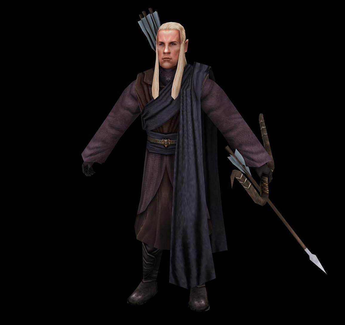
Next is coloring and contrast. We're big fans of a muted color scheme due to the realism this brings, but at the same time we also feel things need to be noticeable ingame. We try to find a middle ground, applying plenty of color where appropriate. A good example of this are the Lothlórien basic units, who, upon receiving heavy armor, are given robes of deep purple:
Getting things 'contrasty' is the last thing we work on before finishing a base model mesh. RotWK is an old RTS in an engine that is less-than-perfect, so unit models tend to blur when fully zoomed out. To still maintain definition, we make sure to cast extra-heavy shadows on everything: a belt will cast a strong shadow on the breastplate beneath it, mail sleeves will cast a strong shadow on the arm sleeves below, et cetera. When viewed in a close-up render these shadows are unrealistically dark, but ingame, they allow model features to be recognized even from a blurry distance.
That's all for this update. We hope you enjoyed. If you haven't yet, please consider voting for us in the 2016 MOTY awards - time is running out!