Jump to content


Photo

Basic HTML and CSS


  • Please log in to reply
11 replies to this topic

#1 Salohcin

Salohcin
  • Members
  • 22 posts

Posted 04 January 2007 - 01:40 AM

Created this for mod sites over at Moddb.com, but can be adapted for any type of site.

Many mods have fallen to the horrors of freewebs.com. Their owners will claim that they do not have the skills to create a site. Well, if you don't wish to take the time to make a good site then you most likely don't have the proper amount of dedication to your mod.

So, to help those smart people who will say NO to Freewebs.com I've created this tutorial.

NOTE: I will not cover all the basics of HTML, so you may want to read a HTML basics tutorial before starting.

One of the most basic and most used methods for site design is tables. Tables allow you to have content divided into columns and rows. Let's start a new HTML document. Open up notepad and enter the following code:
<html>
<head>
<title>Your Mod Name Here</title>
<link rel="stylesheet" type="text/css" href="style.css"> 
</head>
<body>

</body>
</html>

We just created a blank HTML document that will recieve style data from style.css in the same folder. Remember to replace "Your Mod Name Here" with the name of your mod. The text withing the <title> tags, appears in the top bar of your browser.

Now we are going to add the tables. Add this code between the <body> tags:

<table align="center" border="1" height="20%" width="80%"><tr><td></td></tr></table>
<table align="center" border="1" height="70%" width="80%"><tr><td width="15%"><td></td></tr></table> 
<table align="center" border="1" height="10%" width="80%"><tr><td></td></tr>

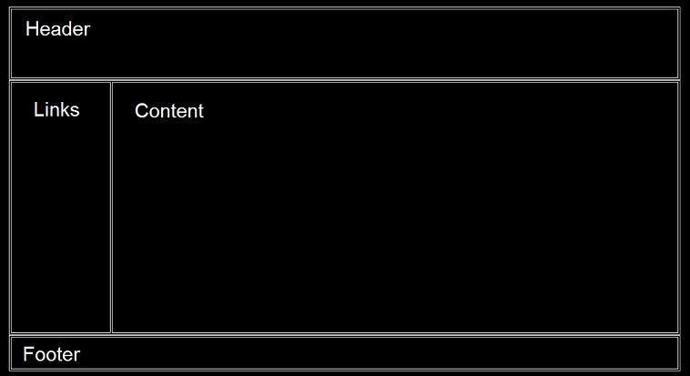
This will give you a table stucture somewhat like this:
Posted Image

NOTE: I added the black background and text. Your will be on white without text.

Save this notepad file as "Index.html"You have finished the first step, on to CSS (I don't mean Counter-Strike: Source n00bs :grin:).

Now we will write A Cascading Style Sheet (CSS) file. This tells the page color, location, size, ect.

Open a new file in notepad and write this:

body { 
background-color: Black;
font-family: Verdana; 
font-size: 14px; 
color: White; 
  }

p { 
margin-left: 20px;
margin-right: 20px;
} 

a:link {
color: #ffffff;
text-decoration: none;
}

a:visited {
color: #CCCCCC;
}

a:hover {
color: #ffff;
text-decoration: underline;
}

font.header {
font-size: 40;
font-color: Yellow;
text-align: center;
}

font.newstitle {
font-size: 25;
}

font.poster {
font-size: 11px;
}

td
{ 
vertical-align: top
}  


I'm not going to explain what this all means, but by scanning though you should be able to figure it out. Feel free to mess with font size, color, family, ect.

Save this as "style.css" in the same directory as "index.html."

Now you are going to add the text and finish up the basic webpage. Change the code between the <body> tags to this:
<table align="center" border="1" height="20%" width="80%"><tr><td><font class="header"><center>Header</center></font></td></tr></table>
<table align="center" border="1" height="70%" width="80%"><tr><td width="15%"><p><ul>
<li><a href="index.html">Home</a></li>
<li><a href="info.html">Info</a></li>
<li><a href="media.html">Media</a></li>
<li><a href="forums.html">Forums</a></li>
<li><a href="team.html">Team</a></li>
</ul>
</p></td><td><p><font class="newstitle">News Post Title</font>

<font class="poster">By Salohcin :: 1/2/07


News goes here.

</td></tr></table> 
<table align="center" border="1" height="10%" width="80%"><tr><td>Footer</td></tr></table>

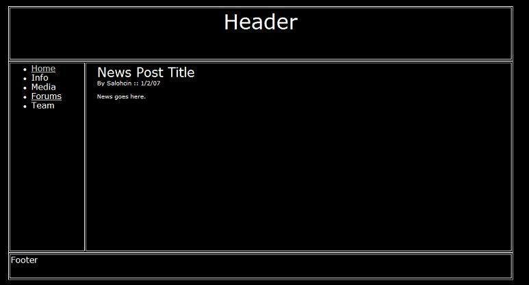
This basically added text into the tables using the styles defined in the CSS file. Now you can easily change the style from the .CSS without even touchiing the HTML. Your page should look somewhat like this depending on the changes you made to the style:

Posted Image

Again, I won't explain all the HTML, but instead leave it to you to figure out what everything does and then change it to your purposes.

Thank you for reading, and good luck with your mod!

#2 -tr8er8-

-tr8er8-
  • Members
  • 7 posts

Posted 04 January 2007 - 03:10 AM

Erm... ok?

That was sorta random and all but ok.

#3 Samael

Samael

    Living life to the fullest

  • Project Team
  • 1,477 posts
  • Location:Seraphim
  • Projects:Living my Life the right way
  •  Baller

Posted 04 January 2007 - 03:42 AM

This is a good Html for basic learns, since not that many people know about Html and how to web design. You could gone a little further with Java scripting. :grin:

#4 Salohcin

Salohcin
  • Members
  • 22 posts

Posted 04 January 2007 - 05:00 AM

Thanks Samael

Erm... ok?

That was sorta random and all but ok.


Was I not supposed to post it here or something? :grin:

#5 Dirt

Dirt

    How do I know?

  • Members
  • 344 posts
  • Location:Bangkok, Thailand
  •  Shocker

Posted 04 January 2007 - 05:07 AM

Its a basic type of webmaking, but sometimes like in MS webs its complex. Currently i have a project of my own but i'm not sure to create a web just yet :grin:. If you want to get mastered at complex webmaking , go to a programming school ;).

[EDIT] This is my 300th post roflmao

Edited by Shocker, 04 January 2007 - 05:09 AM.


#6 Jeeves

Jeeves

    I write the interwebz

  • Members
  • 4,156 posts
  •  Friendly neighborhood standards Nazi

Posted 04 January 2007 - 07:15 AM

Advise against tabular layouts, anyone learning anew may as well learn it right.
Glish.com/css has some good basic CSS layouts, with source displayed on-page.
This site also has lots of CSS, but some of its more advanced. Likewise with CSSplay and CSS Zen Garden. Basically in a CSS layout you just define the sizes and possitions, as well as formatting, of elements. This leads to cleaner neater markup, and more flexibility with layout (as being defined entirely from the CSS it can be changed over a whole site easily, see CSS Zen Garden) both with design and browser (ability to have a seperate layout for ppcs, phones, projectors, etc.).
Also tables are messy and unnecessarily complicated, often view badly, and can mess up your search engine rankings. They have their uses, but not for layouts.
For newcomers to html and css, I also recomend htmldog, easy tutorials and good reference.

World Domination Status: 2.7%


#7 Ingwe

Ingwe
  • Members
  • 20 posts
  • Location:Cuivienen, as it once was
  • Projects:Web design, networking, etc.
  •  The Sire of Long Posts

Posted 16 March 2008 - 01:16 PM

Yeah.....I'm in agreeance with Jeeves here. The font tag is one of the most abused elements in Html, and has resulted in phpNuke's layout being FULL of font tags. The font tag is only the extreme beginning of the presentational element in markup/structure. Then there are the presentational attributes. All in all, I don't even like <hr /> or <br /> tags. I like the idea of using the paragraph tag, where spans, em, etc are for the emphasis and styling of text.

That is a good tutorial on the basic Html 3.2 stuff and that's how it was done then. I don't disrespect the old ways of doing it because it's from the disasters of the past (Apollo 1 and Html 2.0,3.2,etc) that we improve upon things. Html 4.01 Strict is the minimal I have actually dealt with since three years. I've been using the XML-Based (Module-based) Extensible Hypertext Markup language (Xhtml 1.1) as well as Xhtml 1.0 Strict and making XML and CSS in sites for a while, and have been thinking about putting a tutorial up for, like, two months I think it is now, but always got side-tracked as of late.

Layouts should not use tables. CSS Positioning and/or floating elements along with clearing those elements (clear:both) to put content underneath them is the best use for layout. Data that must be in a grid that degrades well (in other words, changes with viewport without you having anything over a 100% width, which requires in addition some WML and media="handheld" stylesheets, things like that) can be put in a table, but not so recommended. Turn styles off on your browser (say you have Moz-Firefox and the web developer addon, you can turn off styles on a page) - you can immediately see what the layout would be like with tables and without tables.

One of the sites Jeeves pointed out, which is CSS ZenGarden, works well without styles and lists well, and is compatible with WML. If you were to take styles off on a site with nothing but tables layouts, the widths would not degrade well, in other words it's not very fluid.

For things like statistics and phpmyadmin viewing of MySQL tables, and viewing anything that is a grid, if tables must be used they should be used in a way that doesn't cause overflow off the viewport. Having a minimum width of no more than 640 pixels will virtually guarantee that screen media will be read alright.

How do you accomplish the floating of divs (as opposed to positioning)? Well, the answer comes as somewhat of a surprise. Internet explorer doesn't always react well to it (does it react to anything the way it should - the very existence of an activex/javascript property in css for Internet Explorer is just beyond my ability to figure out why they would do that - that property being expression - just as data, style, and structure should eventually be separated, so should client-side ECMA (Java) script, more or less kept away from each other with a 40-foot cement barrier in between them).

Let's say you have three columns. You are using divs (or if you want to delve into the odd, different types of lists, and they can in cases be good to use for such layouts if they are indeed lists of common data that is being pulled up, like the Revora heads-up menu). You have two choices - positioning or floating. In CSS3 with IE8+Acid2 you'll be able to use a THIRD option. We'll discuss this further in a bit though.

The following div (or you could use a paragraph tag) will clear lines so that your floats don't end up all over the place (if you're like me, you've had it happen to you before):

Html:
<div class="clear_both"></div>

CSS:
.clear_both{clear:both;height:0;max-height:0}

The above clears both sides, right and left, so that the stuff following will not float to the top. The height and max-heights are set as safe-guards against this thing having any kind of size. It simply tricks the browser. To give divs some kind of actual height, you have that as an option, especially in the case that your floating divs have backgrounds or images that you don't want cutting off before the content ends inside

Html:
<div class="article">
<div class="col1"><p>One tequilla</p></div>
<div class="col2"><p>Two tequilla</p></div>
<div class="col3"><p>Three tequilla</p></div>
<div class="floor"><p>FLOOR!!!</p></div>
<div class="clear"></div>
</div>

Css:
.article .col1, .article .col2, .article .col3{float:left;width:25%}
.article .col4{float:right;width:25%}
.article p{border:1px dotted #77f;color:#77f;margin:0.25em;padding:0.25em}
.article .clear{clear:both;height:0;max-height:0}

The paragraph tags will be there just in case you wanna add more lines inside that (which is why I'm going to love Xhtml 2.0 - introduction of the line tag - I have it enabled through XML on my own site though, along with nl (navigation lists), section (a structural element similar to div), separator (which is an empty tag like hr except with the hr (horizontal line) it just seems so presentational in nature)).

In the above example, what you generally get is simply one row. The last clear line simply clears the line so the stuff below it can be display in some dignifying way instead of jumping all over the place. The first three columns float left, the last right. It works in IE7, Mozilla, Opera, and Netscape. I am not sure of IE6 but I imagine it works there, at least to some extent, though while resizing your page in that view in IE you'll likely see the last column jumping to the next row and back up at the end of the row again really quickly as you resize, sort of what you would imagine if your web designer were on a LOT of drugs.

The paragraph tags inside those floating columns have their own text color set by default to #77f (or #7777ff - it can be defined with 3 or 6 characters, depending on what level of complexity in color you wish to have). #77f is a pleasant blue color - not too blue but adds emphasis where needed. It is similar to the color of the arrows on the undo and redo buttons on the post form of the Revora Main Theme. The p tags also have a border of the same color that is dotted. They have margins of 0.25em as well as the same level of padding, so there is consistent padding and margins. If you want to have exactly 0.25em between everything, just remember this:

CSS:
.someclass{margin: top right bottom left}

The margin property can take the auto value as well, and that is useful in the case you want to center a block:

.centerthis{margin: 0 auto}

In that example, 0 is for top and bottom - auto is for left and right.

The "padding" property CANNOT take an auto value.

Fiddle around with that example and see what you can do with that.


Oh, and PLEASE put your style statements at least in an element tag somewhere between the head tags (near all the meta-data) - and not in a style element inside the body tags, or even in an inline style line.


Example of inline styling:

<p style="border: 1px solid #77f">Stuff</p>


The inline style attribute is going to be deprecated in future markup, and is generally confusing anyway since you want all your presentational stuff in one place where you can easily find it - in a CSS file.


Positioning is another way to achieve div columns. Another way will be the display property - the main div would have a style with "display:table" in it and the cells would have "display:table-cell" in them. It's definitely something to consider using eventually, when enough people update to newer browsers that is. Opera and Firefox and Netscape, and Safari, support that alright. Some other browsers just don't.


Now the comparison from the above example to...the older example:

:rolleyes: Newer Example:
Html:
 <div class="article">
  <div class="col1"><p>One tequilla</p></div>
  <div class="col2"><p>Two tequilla</p></div>
  <div class="col3"><p>Three tequilla</p></div>
  <div class="floor"><p>FLOOR!!!</p></div>
  <div class="clear"></div>
 </div>
 
 Css:
 .article .col1, .article .col2, .article .col3{float:left;width:25%}
 .article .col4{float:right;width:25%}
 .article p{border:1px dotted #77f;color:#77f;margin:0.25em;padding:0.25em}
 .article .clear{clear:both;height:0;max-height:0}

:( Older Example:
Html:
 <table>
   <tr>
	   <td width="25%" border="1"><font color="#7777ff">One tequilla</font></td>
	   <td width="25%" border="1"><font color="#7777ff">Two tequilla</font></td>
	   <td width="25%" border="1"><font color="#7777ff">Three tequilla</font></td>
	   <td width="25%" border="1"><font color="#7777ff">FLOOR!!!</font></td>
	</tr>
 </table>
 
 Css:
Heh...none, it's all in the markup because it's 1996 all over again.


In olde html I'm not sure what the border color attributes were. I imagine they were probably...um...borderColor="#7777ff" or something. And the font tag had fontStyle, fontColor, fontFamily, and so on.

The above wouldn't be the worst case example. That actually looks really neat compared to what I've seen. Here's an example of what to definitely avoid:

<table class="bodyline" width="100%" cellspacing="0" cellpadding="0" border="0"> 
 <tr> 
   <td valign="top">
	<center>
	  <table width="100%" border="0" cellspacing="0" cellpadding="2" height="86">
		<tr>
		   <td background="someimage.jpg" width="100%" height="80">
			 <table width="100%" border="0" cellspacing="2" cellpadding="0" height="168">
			   <tr>
				 <td width="7" height="64">
				 <p align="center">
					<td nowrap width="100%" height="64">
					   <p align="center"><b>
						  <font class="tit" color="#FFFFFF">&nbsp;&nbsp;&nbsp;&nbsp;&nbsp;&nbsp;&nbsp;&nbsp;&nbsp;&nbsp;Logo using white space for margins :P</font></b></p>
				   </td>
				</td>
				<td width="4" height="64">&nbsp;</td>
			  </tr>
			</table>
		  </td>
		</tr>

I had to change some of the content in that above example as it would put to shame the organization using that code...and the rest is about 9,000 times worse.

I don't see one line in the example I showed just now that I would agree with.

Amazing how easily controlled by CSS such a layout would be. You would probably end up with 10 times less presentational elements, ZERO presentational elements, and a heck of a lot less of what you don't need. That way you spend less time figuring out where on Earth to modify presentational stuff because your structure is bad, and more time instead on just making a site better just through a CSS file.

Javascript is amazing, it really is. But guess what, it's just as abused and I've seen many make a mockery of it. There are some things best left to CSS and Html. Other things are best left to XML. Javascript should be doing the really cool stuff for your site, but should not be the thing that designs it, it should only extend functionality.

So that's about all for now. I worked late night shift until a bit ago and will have the next day to sleep in, until later.
Valimar Design: Web Design, General Tech, Science, Artwork, Literature (RPGs, Fan fictions, discussion), Battle for Middle Earth, The Elder Scrolls.

#8 Jeeves

Jeeves

    I write the interwebz

  • Members
  • 4,156 posts
  •  Friendly neighborhood standards Nazi

Posted 22 March 2008 - 01:52 AM

How I missed this is beyond me, but in responce to "I don't see one line in the example I showed just now that I would agree with," how about </table>? :rolleyes:

World Domination Status: 2.7%


#9 Ingwe

Ingwe
  • Members
  • 20 posts
  • Location:Cuivienen, as it once was
  • Projects:Web design, networking, etc.
  •  The Sire of Long Posts

Posted 22 March 2008 - 03:19 AM

How I missed this is beyond me, but in responce to "I don't see one line in the example I showed just now that I would agree with," how about </table>? :rolleyes:


I would have to agree, if that truly was the -LAST- table ever. A most good point. If they were re-specified to something sensible or used the right way and not so terribly abused, tables still would be alright. Xhtml 2.0's spec for table basically requires a semantic usage of it, but how many sites out there are going to be using that spec in the next 15 years? Tables, as they are used now, are all tr's and td's, with td's and sometimes even tr's nesting other tables inside them. I've heard that Invision Power Board's updates in the future are going to be using other elements for layout instead of tables and that's news I probably have been waiting for for a few years.

For new learners, please don't let them start you out with bgcolor, bgbackground, topmargin, or any presentational attributes or elements. Don't ever let them tell you you can put a table inside of an em tag or use iframes or marquee or things like that. Those methods are actually harder and more tedious than the actual realistic model of design. When your structure is better, you can spend more time (which you will) on making cool graphics, backgrounds, logos, and buttons along with content, and no longer have to worry about repairing the structure. If you learn that way, you'll make a template that you'll not often have to modify (unless you add new blocks to your site, then you can).

The entire example is CSS ZenGarden. They give you a sample of their markup (html) and their css files, of which there are many to choose from. Some of it is memorization and repetition. You need to know how to throw in your doctype, meta info, where to put your scripts (hopefully those are put in separate files), how to import css and xsl, and how to use the properties in css and elements in html.

Basic html means to me a basic standard to follow, not the 1998 model.

With xhtml 2.0 there will be a new line (l) element that will be more semantic than using line breaks (br). That's really nice. Section element will be there too to provide a better structure. In sections will be divisions (divs) and inside can be lists (ul, ol, nl, dl, etc) or paragraphs (p). ol and ul will have li for list lines, dl (definition lists) will have di to group terms with definitions or you can use just dt for term and dd for the definition. Inside of paragraphs are lines (no, not tables, please...God...no). Tables for layout, no-no. The guilatine bug in Explorer can be gotten around with a few different methods, and one method in particular I don't like is having to add an extra empty div just to clear everything below floats, and that doesn't always work either. em and span will still be in that spec, the form method will be XForms; XFrames has not been implemented or completed yet (I've never used frames before, I used positioning though which is just as good, well, better actually). There will be no Xhtml 2.0 Frameset or Transitional, just the flat DTD, kind of how Xhtml 1.1 was/is. style attribute gone (which is good). Cellspacing and padding for tables is gone (thankfully - that was getting annoying to see). If tables were not abused, the element could still be in use. th should be used inside of thead for headings and td for table data - not always the case, well, usually not the case. Trying not to flood your markup with a million classes for css isn't a good idea either. Your css file may go a little above 50kb for a sizeable site, but should really not exceed that. Some see the new spec as jumping on the bandwagon with all the newest and latest stuff that few can use. Hey, if your browser handles XML, it can handle the currently-available Xhtml 1.1 or 2.0 when it arrives. Or stay with Html 4.01 Strict while using stylesheets. If that's all you need, that's all you need. Just don't make excessive use of tables, don't put p's inside of span's, don't overlap tags or nest incorrectly, use css always before inline style attribute or any other presentational attribute (width="100%", border="1" and so on are presentational attributes - don't use them, let css do the presentational work, or if you're daring enough, have some xml using xsl stylesheet). With XML you can make your own elements and if you know DTD you can implement that (though it won't validate with w3c's validator as it only accepts approved document types). So if you want to take use of the section or line (l) elements before the xhtml 2.0 spec is released, that's totally possible and feasible!

On the web development (php+sql) end, when doing SQL queries, try to use is_numeric for numeric values and double-check with the mysql_real_escape_string function (see php.net for more info on that). Afterall, if you've completed a nice template that has a minimal and semantic structure with great css and backgrounds and content, you don't want it torn apart by someone who's testing to see if you've implemented that or not (they don't care if you have or not, they will open any back door that you didn't lock with or without your knowledge or approval - learn to hack your own site if you run your own server and see what doors are unlocked as often as you need to). That way you will not go all too wrong. Your last line of defense is backup. If you run your own server, easy to do. If you don't, get a backup sql file and go from there. At most you'll lose several forum posts if you run a forum and you happen to get unlucky. In addition, server logs serve you well.
Valimar Design: Web Design, General Tech, Science, Artwork, Literature (RPGs, Fan fictions, discussion), Battle for Middle Earth, The Elder Scrolls.

#10 Bart

Bart

  • Network Admins
  • 8,524 posts
  • Location:The Netherlands
  • Division:Revora
  • Job:Network Leader

Posted 23 March 2008 - 01:54 AM

I know tables weren't meant for layout, and they often aren't the complete solution (resulting in nested tables), but on the other hand, they often work better than a lot of divs with complex floating, which get nearer to hacks than proper layout. For example, take a look at the3rdage.net, in which I used tables, and tell me how this could be done otherwise.

Who can tell me, what will there be in the future (or now?) to facilitate easy creation of grid layouts?
bartvh | Join me, make your signature small!
Einstein: "We can’t solve problems by using the same kind of thinking we used when we created them."

#11 Jeeves

Jeeves

    I write the interwebz

  • Members
  • 4,156 posts
  •  Friendly neighborhood standards Nazi

Posted 23 March 2008 - 03:45 AM

CSS3 Grids and Advanced Layouts modules, implimentation of CSS2.1's display:table properties, columns outside of Webkit and moz-specific notations...

The facilitation for the creation of tabular grids has been in the specifications for over a decade, its just been useless because IE<8 doesn't support it. Anything passing ACID2 will cope with the display:table range of display types.

However, its not just lack of standards support thats a problem here, I think people should really get outside the 1992 frameset of all web pages must be set out as though it were a table anyway. Most of the best looking sites I've seen could not have been done just using tables, CSS is soo much more flexible than that. Yes, tables are currently the hardest thing to emulate with CSS, but you shouldn't be limiting yourself to trying to make a clone of every other frontpage anyway.

World Domination Status: 2.7%


#12 Ingwe

Ingwe
  • Members
  • 20 posts
  • Location:Cuivienen, as it once was
  • Projects:Web design, networking, etc.
  •  The Sire of Long Posts

Posted 23 March 2008 - 10:31 AM

Third Age is great the way it is, no doubt. I'm not trying to harass anyone if that's the impression I gave.
Valimar Design: Web Design, General Tech, Science, Artwork, Literature (RPGs, Fan fictions, discussion), Battle for Middle Earth, The Elder Scrolls.


2 user(s) are reading this topic

0 members, 2 guests, 0 anonymous users