Jump to content


Photo
* * * * * 1 votes

My Entire Art Collection Including Portfolio By AggressivePanda.


  • Please log in to reply
13 replies to this topic

#1 AggressivePanda

AggressivePanda
  • Members
  • 107 posts

Posted 28 August 2014 - 12:02 AM

The cnc Online trailer -http://www.gamerepla...howtopic=950328

June Artwork -http://www.gamerepla...howtopic=949344

July Artwork -http://www.gamerepla...howtopic=950240

Pjams Stream art -http://www.gamerepla...howtopic=948769

February/January Artwork -http://www.gamerepla...howtopic=942343

Also the statistics are here -http://www.gamerepla...howtopic=942343

I also done cnc zones channel -https://www.youtube.com/user/CNCZONE
eytsh's channel - https://www.youtube.com/user/eytsh83
My own channel -https://www.youtube....r/LEVIATHAN4500
The Intire XZR clan
Bonus Ru's Stream and Bike Rush Ownz's stream and Pjamers Stream (some of it) Also DimertyCNC Stream
 
This is the main one here -------->>>>>>>>>>>>>>>>>  My portfolio ----->>>>>>>>>>>http://aggressivepanda.carbonmade.com/

Edited by AggressivePanda1, 28 August 2014 - 12:18 AM.


#2 Mathijs

Mathijs

    Post-modern Shaman

  • Network Leaders
  • 13,756 posts
  • Projects:Age of the Ring
  • Division:Revora
  • Job:Leader

Posted 28 August 2014 - 12:16 AM

You seem to have botched the GameReplays links. I'd get on that... :p


No fuel left for the pilgrims


#3 AggressivePanda

AggressivePanda
  • Members
  • 107 posts

Posted 28 August 2014 - 12:21 AM

Its 1:11am here sorry I know I know I did ask for your opinion on my art and half of it missing but! It will be fixed tomorrow most certainly.

And them link work on gr.org but not here which is strange I guess my botch job is worse than I thought.

#4 Pasidon

Pasidon

    Splitting Hares

  • Network Admins
  • 9,126 posts
  • Location:Indiana
  • Projects:Writing Words With Letters
  •  I Help
  • Division:Community
  • Job:Community Admin

Posted 28 August 2014 - 01:04 AM

Yea, get them links fixed.  Unless they're some sort of metaphor, then I don't get it.  


Art Collectio, eh?  Sounds like a Roman Gallery.  


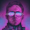
So your art for the different channels...the eytsh one is very good.  Now did you Frankenstein that together?  Because if you did, that's hardly your own work.  Something in a portfolio needs to be your original pieces.  They can be inspired by something, but they should be made from your own efforts, not relying on a different party to supply a fraction of the visuals.  It's very misleading otherwise. 


Your CnC zone work brings up a big point about a good deal of your content: it's very illegible.  When it comes to color selections with lack of contrasts, effects that get in the way, or letters so foreign, they're hard to recognize as letters at all... you do have a few illegibility issues.  Different fonts are cool and all, but they need to be formed in such a way that they're immediately identifiable.  


Now those desktop backgrounds.  Firstly: 1080p, my boney butt.  Those are about 900x500 pictures, and they would barely fit a Gameboy Advanced screen.  And also, they're a bit simple.  The first two, the sub and the boat, looks like grey-scale toys with some particle effects around them.  I do like the particle effects, but that shouldn't really be the highlight now.  And the water effects on that boat are a bit... well... no.  Your green P is about the same, in the contexts of not much happening.  Your BOOP thing is alright.  The blur effects behind them are a bit bad, but it's a bit different.  Even though that symbol above the BOOP is... confusing.  Is it some sort of M?  A fox with two beady eyes?  A M with two facing P's?  Is it just two P's?  Can I eat them?  Stop blinding me with art... it hurts my brain hole.


I think the main problem you have is that you're not showing much of your own creativity.  Like I watched the GFX BOOP logo time lapse (totally my invention), and it's all just using premade templates and effects, with some retexturing, lighting effects, and other knitted details.  This means your work relies on what neat tools you have, rather than your own hand adding the details.  In contexts of you getting hired to do work, an employer would prefer someone who doesn't rely on these templates or effects.  They do look quite nice, since this is a community of amateur, practically self-trained artists looking at others of the same cloth.  But on a professional level, people who hire are looking for so much more.  They want to see you using simplicity and complexity effectively. When you have en empty space, you know how to aesthetically use it, or rather, not use.  


I could also say something pretentious like "be more careful about your color selections, since colors give us feelings."  But that's weird and probably dumb, so I won't.  But yea, you need more practice / different ways to use your tools effectively.  But being someone who sucks at art and does not actually employ artists, all of that is probably tosh anyway.  But that's just my long-winded opinion.  And what a long wind it was... no way I'm proof reading all dat'.  Enjoy!


#5 AggressivePanda

AggressivePanda
  • Members
  • 107 posts

Posted 28 August 2014 - 11:28 AM

Most of the particles and effects/texture and all models are created by me? And the 1080p was downscaled to that resolution as its on a website.


Overall what would rate it out of ten? Pasidon  


Also did you look at the http://aggressivepan...rojects/5313491 YouTube banners and channel art as you didn't mention them in your post even though it went on forever xD.


The boop logo was actually a b turned 90 degrees to its left :D


Also You expect alot from a gfx artist starting off 


Edited by AggressivePanda1, 28 August 2014 - 11:51 AM.


#6 Pasidon

Pasidon

    Splitting Hares

  • Network Admins
  • 9,126 posts
  • Location:Indiana
  • Projects:Writing Words With Letters
  •  I Help
  • Division:Community
  • Job:Community Admin

Posted 28 August 2014 - 04:14 PM

Well, you said you're looking for work.  As someone who would be paying an artist money, or entrusting them with aesthetic decisions that reflect my organization's goals and community (or what-not), I would expect said artist to not be someone who looks like they're just starting.  Or someone who does a particular art style well enough, but no evidence of much outside of that style.  I would prefer someone who has much more experience and proven ability in many styles that I can personally view in a portfolio, or even a YouTube channel. So yes, if I were the one hiring, I would expect a lot from a GTX artist starting off.  Because he better be good for the money I'm paying.   And that's what we're trying to accomplish here, right?  Which is getting your work in such a place, hiring you would be a naturally easy decision to make.  But, as the problem stands, you do have issues within your work, and you don't often leave your style.  Whatever you would call your style... dystopian explosion, or whatever.  


And no, I didn't see that link. They do hold some of the issues I've been discussing.  The main one being... well... they're all the exact same style.  If someone is looking for dystopian explosion box font, then sure.  But if you're looking for work in the art world, or as some people call it: splitting a nail with a dirty diaper... you will need some more variety.  And Again, your font styles confuse me.  What's that first banner say?  Dor\vn?  Dornn?  Darnn?  And after that, I'm guessing that's a big boxy P?  And what's that stuff behind it?  Chick-O-Sticks?  This isn't an unpopular belief: random stuff that looks cool isn't always effective at conveying a message.  And isn't that the point of art?  Especially an adverting banner like that.  Unless the message is that you really do enjoy diabolical looking chick-O-sticks... then my apologies.  


#7 AggressivePanda

AggressivePanda
  • Members
  • 107 posts

Posted 28 August 2014 - 08:50 PM

Huston we had a communication problem. 


Pasidon at this point im not interested in anyone hiring me as a job all I said is for gamereplays.org do you think I have the ability to get staff on set forum website. Allthough I never said that I wanted a job but just asking for your opinion. The style is grunge and I like the look of dusty metal and rust it can make for some interesting images and it says Darwin for the first image.If you look on youtube most gfx artists use this style here are some links.But as I said im only starting off with GFX on a half decent level as I only got acsess to cinema 4d recently = editing tool which has increased the quality of my work greatly.So I will take your advice on to try out new styles as it always is interesting but the rest of it not so much xD as it contained alot of unne.....[nuclear explosion happened here please keep reading]/negative information even some of it [tl;dr] Thanks for trying <3 have a good evening btw.


http://viperedc.carb...rojects/5254479


http://nikocreates.c...rojects/4905986


http://nakeswag.carb...rojects/5109378


:)


Edited by AggressivePanda1, 28 August 2014 - 09:25 PM.


#8 Pasidon

Pasidon

    Splitting Hares

  • Network Admins
  • 9,126 posts
  • Location:Indiana
  • Projects:Writing Words With Letters
  •  I Help
  • Division:Community
  • Job:Community Admin

Posted 28 August 2014 - 09:18 PM

u wat m8?  Unnecessary negative information?  Trying?  It was all valid, ya' moop.  And yea, where were those links earlier?  Those are so much better.  Good lord.  If you would have showed me those first, I would have been, "Oh.  Yea.  Wondrous work.  I'll be off now."


#9 AggressivePanda

AggressivePanda
  • Members
  • 107 posts

Posted 28 August 2014 - 09:25 PM

Huston the Apollo 11 has crashed


Here is June Artwork http://www.gamerepla...howtopic=949344


Here is My first Main art post http://www.gamerepla...howtopic=942343


Here is My July Artwork http://www.gamerepla...howtopic=950240


I didnt mean it that way </3 I meant it by as it was mostly all negative but valid and well set out I must add and was wondering did you have any good points about the work? Imagine I never said unnecessary. 

Attached Thumbnails

  • Apollo_11_LLRV_1.jpg

Edited by AggressivePanda1, 28 August 2014 - 09:27 PM.


#10 Pasidon

Pasidon

    Splitting Hares

  • Network Admins
  • 9,126 posts
  • Location:Indiana
  • Projects:Writing Words With Letters
  •  I Help
  • Division:Community
  • Job:Community Admin

Posted 28 August 2014 - 09:45 PM

Good points?  Optimism?  The ways of the cabbage, I say.  But with this type of art, it's either you like it, or you don't.  Any positives I could give wouldn't be that helpful.  Oh, I like the way that symbol looks.  Them colors be trippin', yo.  Criticism helps more than you think.  Because when you make your next floating symbol of mystery and lights, you'll keep the nonsense I said i mind and go, "Oh.  That one brain cripple didn't like my stuff.  Maybe I should try something different and win."  


#11 AggressivePanda

AggressivePanda
  • Members
  • 107 posts

Posted 28 August 2014 - 11:56 PM

Also just done this intro hope you like this one and i know the background is a bit fuzzy but it shall be fixed 


#12 Pasidon

Pasidon

    Splitting Hares

  • Network Admins
  • 9,126 posts
  • Location:Indiana
  • Projects:Writing Words With Letters
  •  I Help
  • Division:Community
  • Job:Community Admin

Posted 29 August 2014 - 05:11 PM

A bit.  But by some strange coincidence, my "art" class today was discussing critiquing "art" "stuff" ... "things."  According to the lesson, I should be analyzing this piece's elements.  It's color, shape, mass, volume, form... hmm... yes.  Quite.  Such mass.  I would, but that's pretentious.


But one good point that was made, is that a signature or logo, should in some way, reflect the nature of what it represents.  What message were you trying to convey with this Simple Talent logo?  What do the colors mean?  The texture of the thing behind the text?  The shape of the thing?  Good lord... the wonders of analysis.


#13 Irenë Hawnetyne

Irenë Hawnetyne

    -

  • Hosted
  • 3,073 posts

Posted 11 September 2014 - 03:28 PM

Ok, I'm not gonna lie. It's painfully obvious in your work what's yours and what's not.

I mean, aside from the blatant use of the C&C:Online logo under the proclamation, as part of "the artwork I created this month [July]", you seem to be borrowing images from every whichway, adding and changing them just enough that they don't exactly resemble the original, then calling them your own.

Just look at this: http://www.gamerepla...-1403790436.jpg

You added PJAMS to a Kane's Wrath promo and called it yours.

Again: http://www.gamerepla...-1403790399.jpg

You added PJAMS to a Pitbull from a stock TW render and called it yours.


Now, some of the logo work, yeah, that's not too bad. But you're wrong to say there aren't any good fonts out there - you just have to look for good ones - and you need to use variation. As Pasidon said, if you're a prospective graphic designer, we would expect more, as we should considering that you are offering your services. Paid for or not, if you're offering a service, you need to do so professionally, and present the most individually created images.

As a last note, reliance on other peoples' work is okay to begin with (we've all been there), but if you do, you have to credit your sources, and get to the point of being able to work independently of them as soon as possible.


"Everyone's a hero when there's nowhere left to run."


Auxiliary Skarn, 2333rd Cohort


#14 AggressivePanda

AggressivePanda
  • Members
  • 107 posts

Posted 12 September 2014 - 07:06 PM

http://postimg.org/i...yi0mb4j03/full/  this is one of my pieces i done recently and the background to the pjams logo the blue one was photoshop.


I made all the models myself also check these out I created  http://aggressivepan...rojects/5313491


This is 100% independant


Back in july I was only starting off  "begin with" and now I've got alot better.


Edited by AggressivePanda1, 12 September 2014 - 07:12 PM.


0 user(s) are reading this topic

0 members, 0 guests, 0 anonymous users