CoPro - Advertise me
#1

Posted 05 May 2009 - 11:03 PM
So I thought it is time to start increasing it's popularity and start spreading the word.
So I suggest to you guys to tell people about this project.
You can tell family,talk about it on other forums,link to it in messenger where ever you want.
Also we'll probably need some signature thingys so if anyone wants a crack at designing some we'll choose the best ones and start adding them to our sigs.
Break dancing into the hearts of millions
#2

Posted 05 May 2009 - 11:13 PM
#3

Posted 05 May 2009 - 11:19 PM

Careful. This link is DANGEROUS. Do NOT click it. This one, however, is fine.
I had the meaning of life in my signature, but it exceeded the character limit.
#4

Posted 06 May 2009 - 03:01 PM
#6

Posted 06 May 2009 - 06:18 PM
#7

Posted 06 May 2009 - 09:35 PM
#8

Posted 07 May 2009 - 02:31 AM
Let's start with fonts for the project.
So find some fonts you think will work well and we'll start there.
Break dancing into the hearts of millions
#9

Posted 07 May 2009 - 03:05 PM
#10

Posted 07 May 2009 - 03:16 PM
#11

Posted 07 May 2009 - 09:13 PM


Sandtrooper Captain: Oh my god. I didn’t know you where sniping right now. I mean, I thought you were on break, so I brought you this delicious Iced Coffee from Dunkin Donuts™.SWMitS-Canterbury
#12

Posted 07 May 2009 - 09:20 PM
I mean, a viking writing or a greek one can be different
edit: yeah, it's only starting with one faction, then adding more later... but still
Edited by Lauri, 07 May 2009 - 09:20 PM.

The 4th Age version 0.8 has been released: Link
#13

Posted 07 May 2009 - 09:48 PM


Sandtrooper Captain: Oh my god. I didn’t know you where sniping right now. I mean, I thought you were on break, so I brought you this delicious Iced Coffee from Dunkin Donuts™.SWMitS-Canterbury
#14

Posted 07 May 2009 - 10:13 PM
Some short notes on selection of fonts:
General considerations:
-------------------------------
- The font(s) should be shareware (freeware, postcardware ...) to avoid any legal issues.
- The font(s) should be of high quality.
- The font(s) should be characteristic for the (historic) 'theme' of the mod.
- The font should have proper kerning, i.e. correct adjusted spacing between different letters, like AV and MN etc.
- The font should be hinted, i.e different font-sizes should have different proportions between strokes and overall hight of the letters; small sizes must have thicker strokes relative to large sizes.
- Fonts usually have a 'typographical' history, i.e. are based on age-old and well established design principles; designing a 'new' font is a very delicate art, requiring a lot of balancing.
bd
Proposal for fonts for a 'historic' mod, theme: Early Medieval (northwestern) Europe (AD 200 - 1200):
----------------------------------------------------------------------------------------------------------------------------------------
Should the decisions in the polls result in a mod based on this theme, there would be only one obvious choice, namely the type-face usually known in modern typography as uncial, sometimes also referred to as half-uncial script or celtic font. The examples below are some modern variations of this font:
examples of Dan Smith's Celtic Fonts:
(and sorry, they don't display very well on this background, should be black on white, but go see them on his own website!)
DS_Celtic-1 is a font containing a Celtic looking alphabet. All of the letters have a 'ROUNDED' style. Examples of the style of Celtic letters in this font:

DS_Celtic-2 is a font containing a Celtic looking alphabet. All of the letters have a 'ANGULAR' style. Examples of the style of Celtic letters in this font:

... both can be downloaded from http://www.acondia.c...ltic/index.html - The ZIP files contains both Windows TrueType and Adobe Type Manager postscript fonts.
Another gifted font-creator is the canadian Peter Rempel. Examples of his uncial fonts, PR Uncial 2003 and PR Uncial Alt Caps 2:


... can be downloaded from http://prfonts.netfirms.com/fonts.htm
Some other freeware uncial fonts can be found on http://www.fontspace...category/uncial but only a few of them are of high quality.
bd
Some historical facts on the 'ancestors' of these modern fonts:
----------------------------------------------------------------------------------
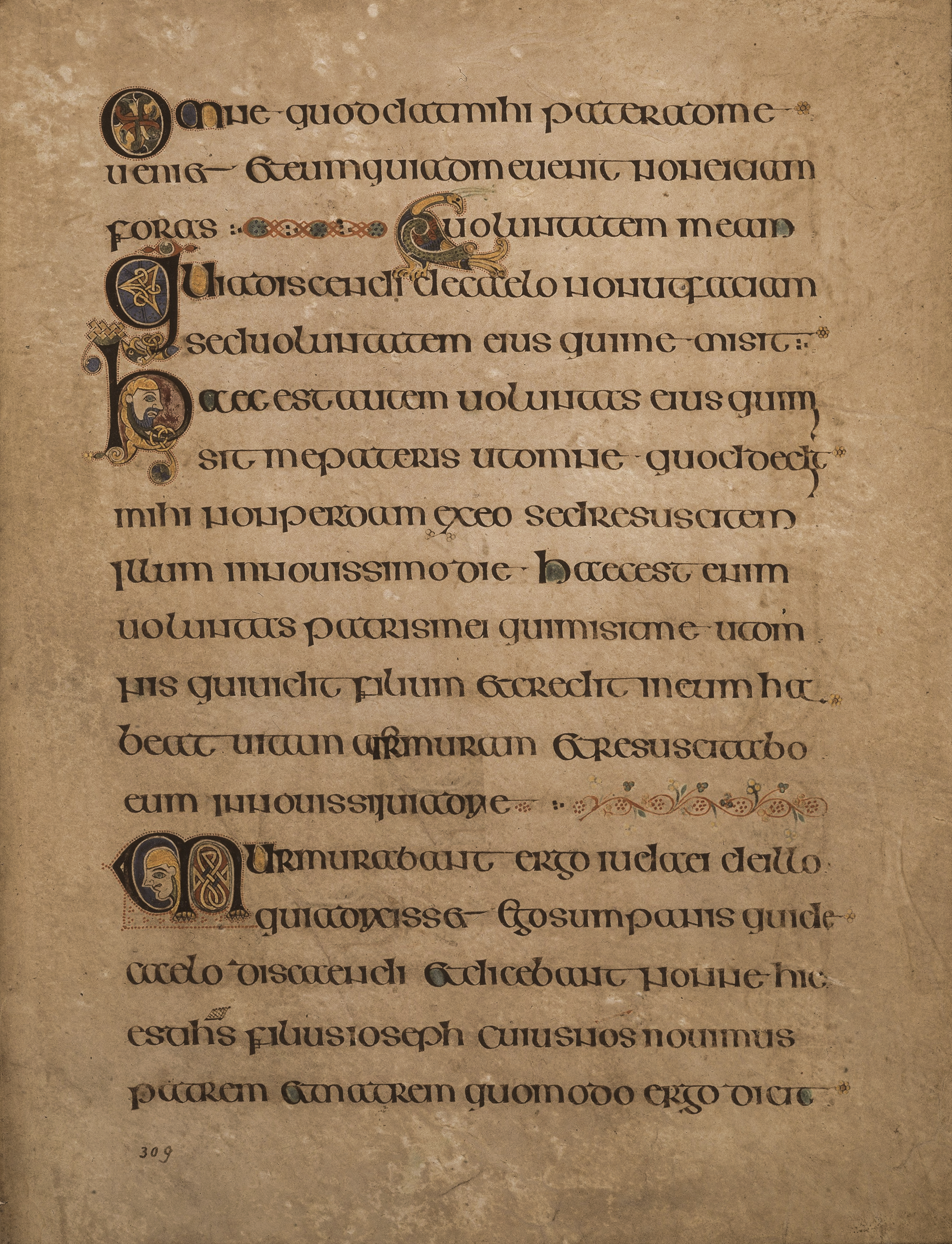
Example: The Book of Kells, c. AD 800, is lettered in a script known as "insular majuscule," a variety of uncial script which originated in Ireland:Early uncial script is likely to have developed from late Old Roman cursive. Early forms are characterized by broad single stroke letters using simple round forms taking advantage of the new parchment and vellum surfaces, as opposed to the angular, multiple stroke letters which are more suited for rougher surfaces, such as papyrus. In the oldest examples of uncial all of the letters are disconnected from one another, and word separation is typically not used. Word separation, however, is characteristic of later uncial usage.
As the script evolved over the centuries, the characters became more complex. Specifically, around AD 600, flourishes and exaggerations of the basic strokes began to appear in more manuscripts. Ascenders and descenders were the first major alterations, followed by twists of the tool in the basic stroke and overlapping. By the time the more compact minuscule scripts arose circa AD 800, some of the evolved uncial styles formed the basis for these simplified, smaller scripts. Uncial was still used, particularly for copies of the Bible, tapering off until around the 10th century. There are over 500 surviving copies of uncial script, by far the largest number prior to the Carolingian Renaissance.

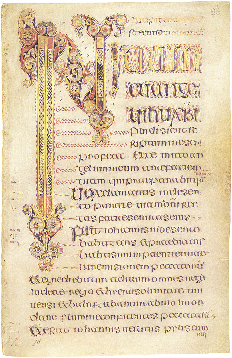
Example: The beginning of the Gospel of Mark from the Book of Durrow.Insular script was a medieval script system used in Ireland and Britain (Latin: insula, "island"). It later spread to Continental Europe in centres under the influence of Celtic Christianity. It is associated with Insular art, of which most surviving examples are illuminated manuscripts. Insular script was influential in the development of Carolingian minuscule in the scriptoria of the Carolingian empire.
The script developed in Ireland in the 7th century and was used as late as the 19th century, though its most flourishing period fell between 600 and 850. It was closely related to the uncial and half-uncial scripts, its immediate influences; the highest grade of Insular script is the majuscule Insular half-uncial, which is closely derived from Continental half-uncial script.
In Ireland, Insular script was superseded in circa 850 by Late-Celtic script; in England, it was followed by a form of Caroline minuscule.

Carolingian or Caroline minuscule is a script developed as a writing standard in Europe so that the Roman alphabet could be easily recognized by the small literate class from one region to another. It was used in Charlemagne's empire between approximately 800 and 1200. Codices, pagan and Christian texts, and educational material were written in Carolingian minuscule throughout the Carolingian Renaissance.
Carolingian minuscule was uniform, with rounded shapes, disciplined and above all, legible. Clear capital letters and spaces between words—norms we take for granted—became standard in Carolingian minuscule, which was one result of a campaign to achieve a culturally unifying standardization across the Carolingian Empire.
Carolingian script generally has fewer ligatures than other contemporary scripts, although the ampersand, ae, rt, st, and ct ligatures are common. The letter d often appears in an uncial form, with an ascender slanting to the left, but the letter g is essentially the same as the modern minuscule letter, rather than the previously common uncial g. Ascenders are usually 'clubbed'—i.e., they become thicker near the top.
... a star shines on the hour of our meeting ...


#15

Posted 07 May 2009 - 10:31 PM
Break dancing into the hearts of millions
#16

Posted 07 May 2009 - 10:49 PM
No, it takes too much time ![]() ... but I'm becoming rather entish and unhasty, talkin' a lot with my trees.
... but I'm becoming rather entish and unhasty, talkin' a lot with my trees. ![]()
... a star shines on the hour of our meeting ...


2 user(s) are reading this topic
0 members, 2 guests, 0 anonymous users


