Jump to content


Photo

Work in Progress (WIP)


  • Please log in to reply
5 replies to this topic

#1 SinKing

SinKing
  • Members
  • 10 posts

Posted 08 May 2009 - 11:05 AM

Put your links from photobucket or imageshack in this folder and update them. Please make sure you use a decent document size so the whole concept/render is visible on the thumbnail. Example:

Posted Image

Edited by SinKing, 08 May 2009 - 11:17 AM.


#2 SinKing

SinKing
  • Members
  • 10 posts

Posted 29 May 2009 - 07:06 PM

Hmm, I must have made a new thread instead of posting my prior thumbnails, here. Perhaps the webmaster can remove the thread, or move it to the appropriate (this) location.

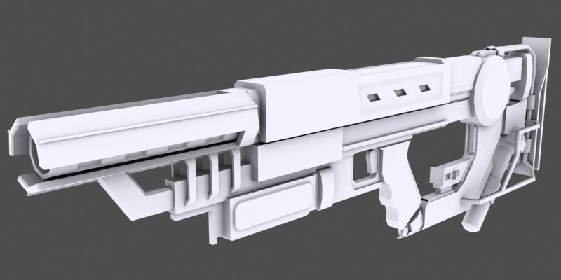
Here is our rifle, 100% done. Many thanks to Berserk and Fábio Santos who let us use his rifle as a base:
Posted Image

Edited by SinKing, 30 May 2009 - 03:52 PM.


#3 Guest_J_*

Guest_J_*
  • Guests

Posted 31 May 2009 - 12:13 PM

Hello everyone! My mod YR: Timeline has been released! There's a new version still ongoing.

Download it here:

http://yuritimeline....m/downloads.htm

Also there are some SHP and Voxels released by me!

#4 SinKing

SinKing
  • Members
  • 10 posts

Posted 31 May 2009 - 01:50 PM

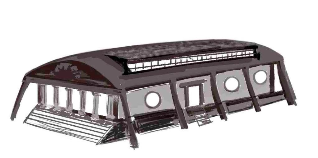
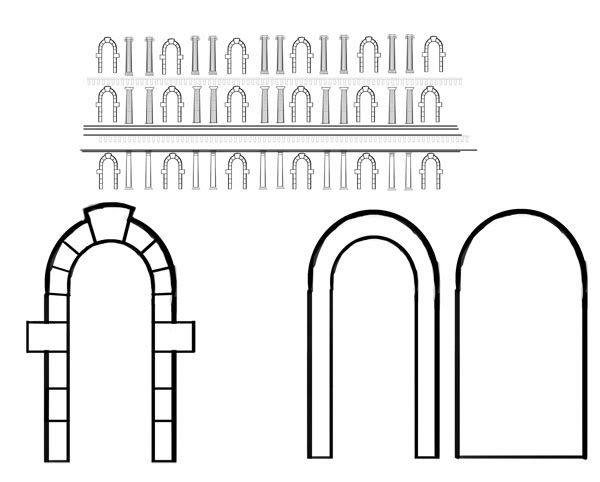
I made another sketch of the map and a close up of the main building. I think we should try to keep this map small in order to be able to finish it in time. The inside will take sometime, too. All of these designs were inspired by Renaissance style. I made a "Moodboard" (actually only a lose image collection at the moment). It should be in our Blue SVN folder, so check it out and add to it!
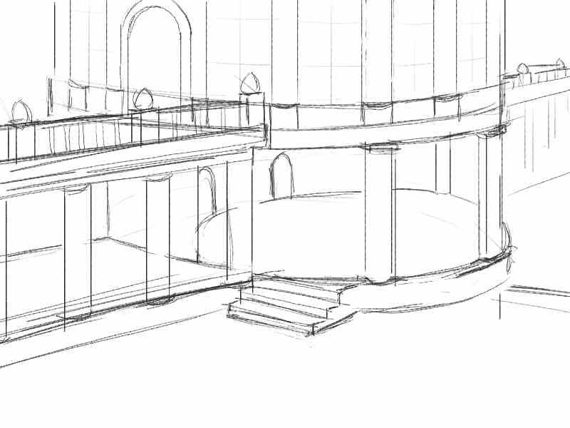
Posted Image

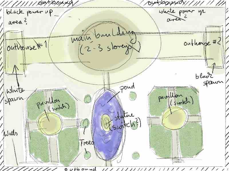
These are my ideas for the first map:

It's an area, enclosed by walls, with one large central building and two (closed pavillons). You can't cross through to the other team's territory on the outside, unless you want to go through the pond and risk exposure. Most action will take place inside the large building and paths of both teams will cross when following their objectives, or going for the outside power ups.
Posted Image


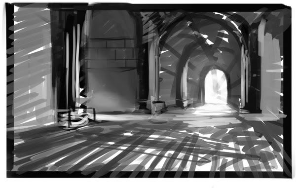
Main Building, inside:

Posted Image

possible outside:

Posted Image

P.S.: I didn't refine these sketches, because I want to confirm first that this is the style we are going for.

Edited by SinKing, 31 May 2009 - 01:53 PM.

#5 SinKing

SinKing
  • Members
  • 10 posts

Posted 03 June 2009 - 07:02 PM

150 views of this forum? -that's embarassing! I really need to put out some better sketches/paintings or feel ashamed of myself. However, I don't find much time, and my head is heavy as I write this, again.
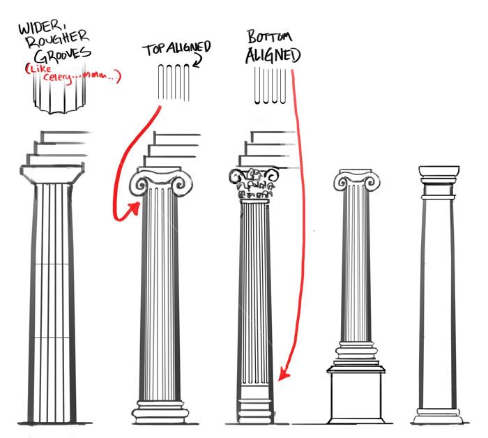
Just a quickpaint of an amalgan of some classical and industrial elements. Somehow more of this could make a nice blend, I feel. Leave som ideas, if you please.

Posted Image

#6 SinKing

SinKing
  • Members
  • 10 posts

Posted 06 June 2009 - 01:06 PM

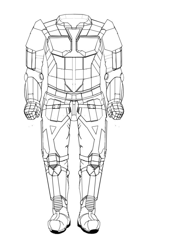
Even though I seem to be the only one postong here, here are some updates from our one and only true concept artist, the Whigz:

Posted Image

Posted Image

Posted Image


1 user(s) are reading this topic

0 members, 1 guests, 0 anonymous users