Jump to content


Photo

some quick sketches


  • Please log in to reply
4 replies to this topic

#1 SinKing

SinKing
  • Members
  • 10 posts

Posted 29 May 2009 - 02:10 PM

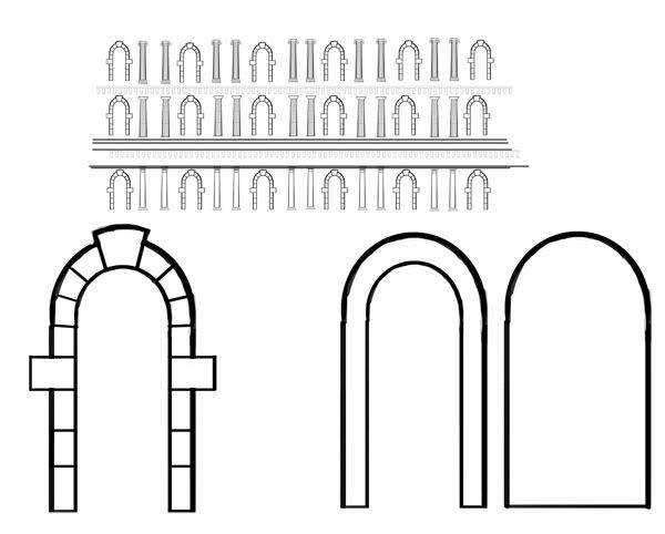
Hi, I thought the first map could perhaps be small and inside a building. There is a small (french) square outside and garden+walls around it. The building itself is open to the front, like a temple and is two storeys high. I have been thinking it should be the center of two wings, so we have tow bases for either team, on each side of the round center piece.

Here are some thumbs, I will improve the quality in time, I just need to layout the buildings a bit better.

Posted Image

Posted Image

Leave a note, if you have thoughts and suggestions. I'm clearly following the classical line we agreed upon,but think this might become a lot of work, depending on the amount of detail we want for the buildings. I would start with only a low poly, plain/non-ornamented version of the building.

#2 Wigz

Wigz
  • New Members
  • 3 posts
  • Location:Utah, USA

Posted 07 June 2009 - 06:34 AM

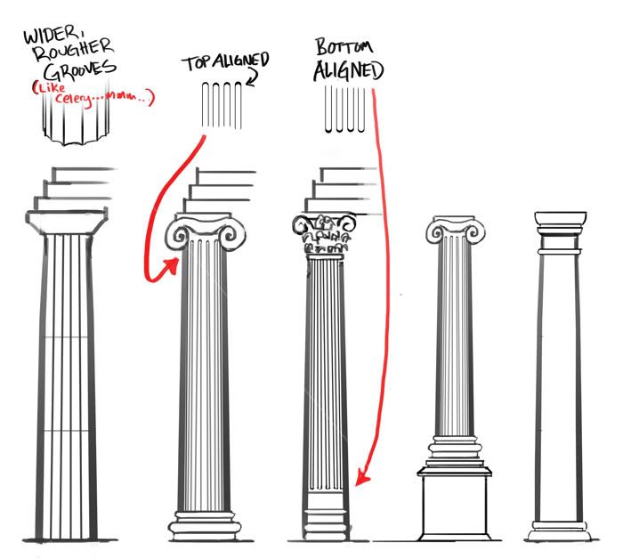
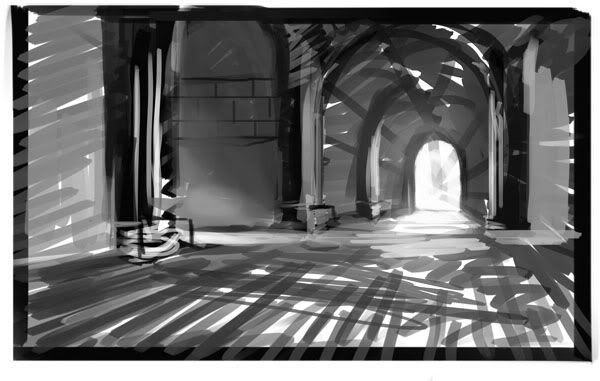
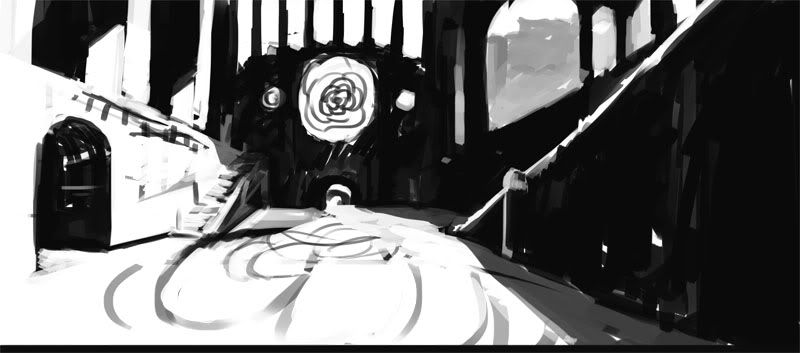
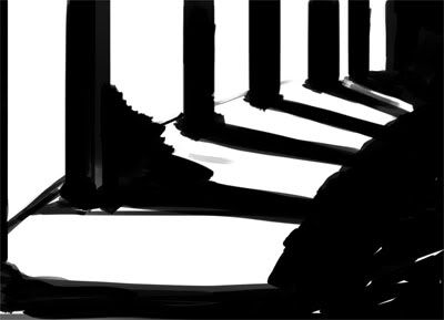
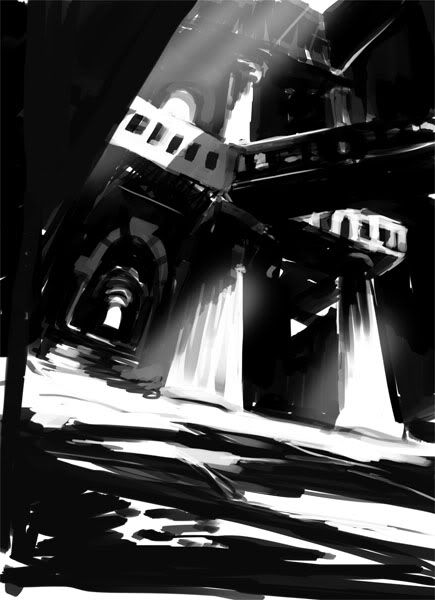
Hey everyone! I've started drawing up some quick sketches based off what info I've received. Some are technical sketches of column types that might be used in more classical themed architecture. The others are quick mood shots to try and play around with the dark/light theme of the game play. There will be more of these coming. Tell me what is relevant or good about any of these, if you don't mind. That way I have a better idea of what works and what doesn't.

I have roughs of a simple map idea that I'll be uploading in a couple days, accompanied by some interior sketches.

Posted Image

Posted Image

Posted Image

Posted Image

Posted Image

Posted Image

Thanks again for feedback!

Edited by Wigz, 07 June 2009 - 06:35 AM.

Work without vision is drudgery; vision without work is daydreaming.


#3 SinKing

SinKing
  • Members
  • 10 posts

Posted 10 June 2009 - 02:15 PM

Good stuff! Now try singling out some areas and get them ready for a modeller to work on. A side, a front and a perspective view would be nice. It doesn't have to be single assets only. It can also be a combination of them, which clearly show the modeller which parts he has to create. Keep it up. Art is all we need to get the brain pumping out ideas and getting inspired.

#4 Wigz

Wigz
  • New Members
  • 3 posts
  • Location:Utah, USA

Posted 12 June 2009 - 04:24 AM

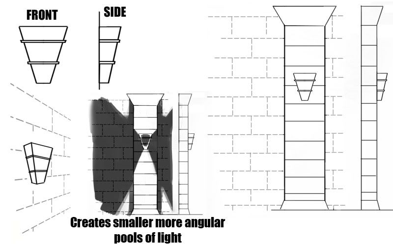
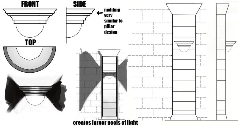
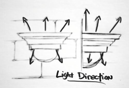
Here are some lighting ideas. These are a very basic base design, which I can easily modify and tweak depending on what's needed/wanted. I'm planning to come up with at least one more basic option. The sconces are intended to be either models that you can slap right on a wall, or they can be mounted on a larger square pillar that juts out of the wall a little bit. I tried to include multiple angles for modelling clarity. I don't know if we will use a combination of these different ideas or just stick with one of them. Someone will have to make the call for what's going to be used and what is not.

Posted Image

Posted Image

Posted Image


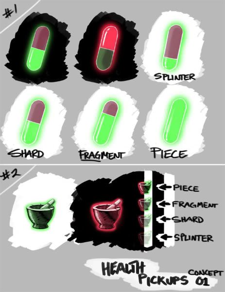
I'm getting started on some pickup items--starting with health pickup ideas. I thought about going with generic handbag with a cross on it, then thought to try the 'pill' idea that was briefly mentioned last week, as well as the idea of a pestle (small cup with a simple grinder used in ancient medicine). The pestles vary in opacity depending on the potency of how much health is there (100-75-50-25%). This same idea could be applied to the pills with the black backgrounds in the upper left. Or, the pills could themselves appear more or less full depending on their potency.

Posted Image


I've got some ideas rolling for the powerups and essence items as well, and will try to get at least some of those done tomorrow morning before the meeting begins, if possible. I was thinking of going for a kind of ancient astrological theme for the essence items.

As far as color go, you can see I've already chosen green to accompany items when in the light and red for items when in darkness. These colors are totally negotiable, of course. I thought that with so many things being effected by light, a steady color theme would work well, if not just in a glowy outline around the objects. Other colors could be used for the interior of the powerup spheres.


Crits/ideas welcome.

Edited by Wigz, 14 June 2009 - 04:05 AM.

Work without vision is drudgery; vision without work is daydreaming.


#5 Wigz

Wigz
  • New Members
  • 3 posts
  • Location:Utah, USA

Posted 14 June 2009 - 04:09 AM

Hey everyone!
I am eager to know what to work on next and how things are going with everyone else, but am unable to attend this week's meeting. You see, it falls smack dab in the middle of my church service, which I won't be able to get out of on a regular basis.

If you could please dedicate some time to discussing the successes/failures of this weeks concepts at vyew, then I will be able to read it later and receive the proper input and feedback I need. Also, anything else that you think I could work on would be appreciated. I could start to combine these different elements to make full scenes (like this http://i613.photobuc...LUE/mood_01.jpg ; i could up the quality significantly if i need to). If ambershee has some mapping basics he would like me to paint over, I am also up for that; just email them to me.

I attended an interesting meeting in tf2 where they picked apart various aspects of the map design. It was cool for me, because that's something im interested in, but have never done. He talked about using some of the default brushes in a way to create the illusion of a world larger than it really is. I'm not familiar with props in ut3; are there brushes that we could use to our advantage considering the theme of this mod, or do we intend all our brushes to be custom made? I hope I'm properly grasping this stuff and not asking dumb questions, lol. I ask mainly to know just how many props I will be designing (like rubble, barriers, and things like that).

Question: My brother suggested a granade-like weapon that would explode with light or darkness, rather than hurt the enemy. Is this possible? It could vary the gameplay a little more.

Other than that I have no questions right now. Sorry I couldnt attend this week. I'll read your responses in vyew chat later.

Work without vision is drudgery; vision without work is daydreaming.


1 user(s) are reading this topic

0 members, 1 guests, 0 anonymous users