Small Update 8/25/10
#1
Posted 25 August 2010 - 06:19 PM
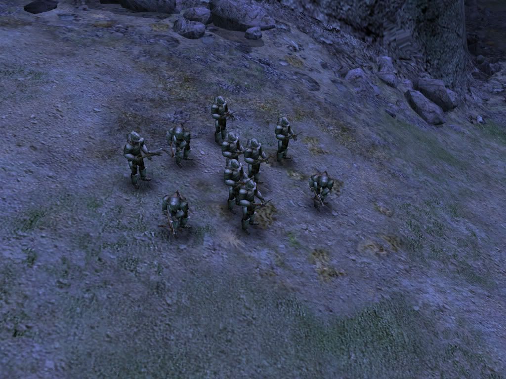
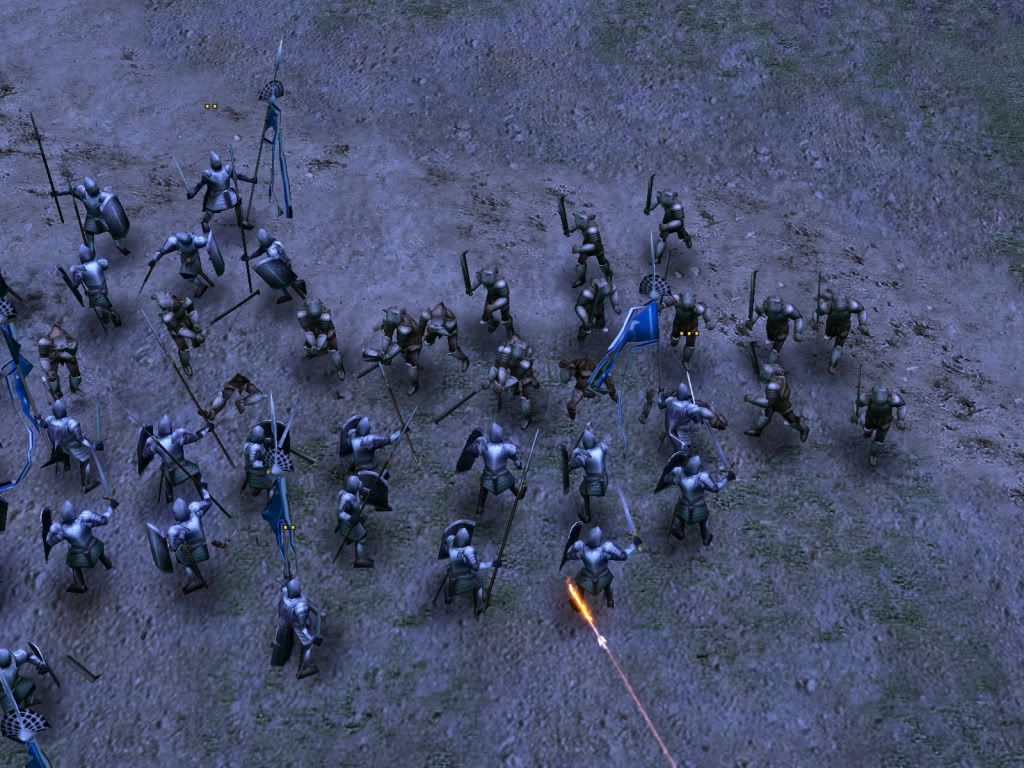
First, I have remade the Uruk-Hai. New model 100% Scratch with the exception of the sword, which is EA's, the crossbow, and the bolt holder thingy. All of which are EA's. The skin also is the EA high res version, tweaked by myself.
Heres the crossbow with regular armor
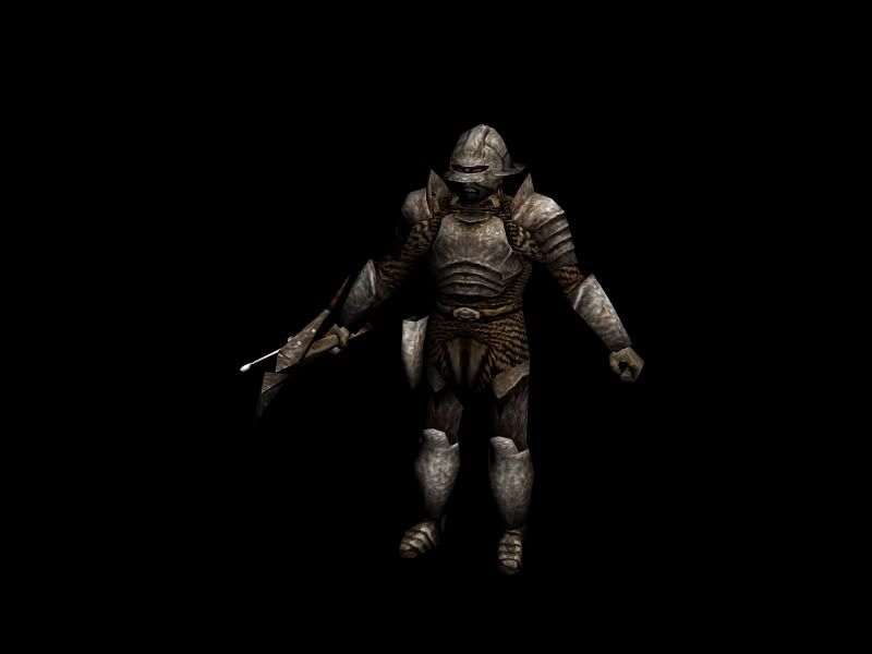
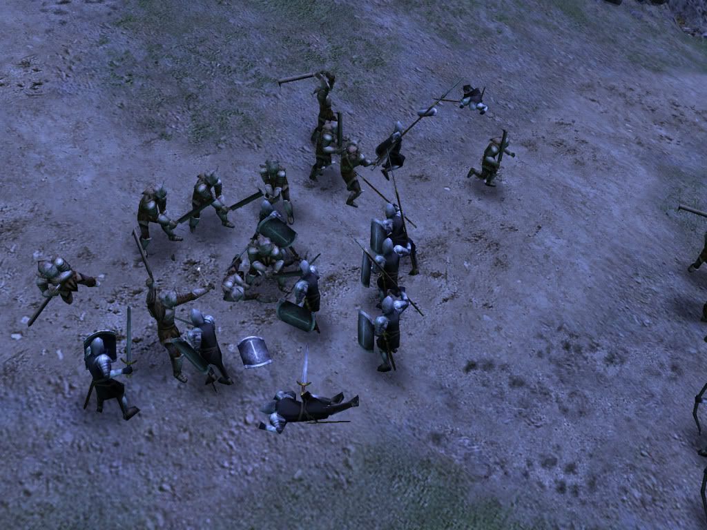
And Here's the standard Uruk-Hai with heavy armor. So You can see the skin difference.
And Here's my latest pride and joy. Granted it doesn't seem like much, but it really is. I remade the menu W3D's so that they would function perfectly in game and still be able to customize them. This, is the load screens you will see right before the game fires up, during and after the load bar screen, and during and after you open/close the spellbook.
I do have a slightly altered version for the main menu background which has the horizontal ring text moving across the screen, but it's not in the load screens because it would look weird without the borders. So when I get a chance I'll take screens of the other various menus and show you all.
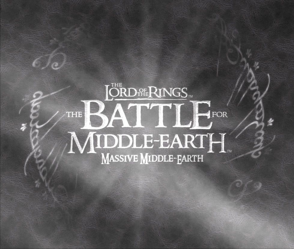
Please, give me opinions, critiques, anything. The mod will have an Isengard theme, which includes an Isengard shellmap. So the grey scale is simply to match that. Though I feel like it's very empty feeling. So any suggestions on coloring would be nice. But it needs to still fit the Isengard theme.
https://www.twitch.tv/vileartist - Yes shameless self-promotion
----------------------------------------------------------------------------------------------------------------------
"Old modders never die, they just fade away" ~ Hostile
#3
Posted 25 August 2010 - 08:25 PM
#4 Guest_bauglir|bro|_*
Posted 26 August 2010 - 01:00 AM
#5
Posted 26 August 2010 - 02:00 AM
https://www.twitch.tv/vileartist - Yes shameless self-promotion
----------------------------------------------------------------------------------------------------------------------
"Old modders never die, they just fade away" ~ Hostile
#6
Posted 26 August 2010 - 02:58 AM
#7
Posted 26 August 2010 - 03:00 AM
https://www.twitch.tv/vileartist - Yes shameless self-promotion
----------------------------------------------------------------------------------------------------------------------
"Old modders never die, they just fade away" ~ Hostile
#8
Posted 26 August 2010 - 04:26 AM
Very nice work. I'm a big fan of the Uruk-hai, even if Isengard has always been my least favorite faction...
Careful. This link is DANGEROUS. Do NOT click it. This one, however, is fine.
I had the meaning of life in my signature, but it exceeded the character limit.
#9
Posted 26 August 2010 - 09:07 AM
This was just quickly thrown together in Photoshop, but i think it shows what i mean:
I just added a drop shadow and bevel to the text, and raised contrast/lowered brightness on the background. It'd be easy if you have a copy with the text on a separate layer.
If you want to go for the whole Isengard theme, you could maybe put a white hand or something in there too
#10
Posted 26 August 2010 - 09:41 AM
For the menu text , I don't really know ; perhaps make it a little bit bright , like _Haldir_ did .
#11
Posted 26 August 2010 - 01:38 PM
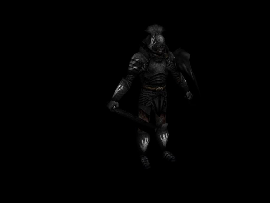
So you could split the white hands on their Shoulderplates, on the helmet, and on the vambrace/cuisse into three randomskins for example. This way there will also be some interesting variety in the horde.
Just a idea. ^^
"Faithless is he that says farewell when the road darkens."
-J.R.R. Tolkien-
"Obstacles are those terrible things you see when you take your eyes off your goals."
-Unknown-
#12
Posted 26 August 2010 - 07:00 PM
Maybe a bit more of a shadow around the text, and a bit more contrast?
This was just quickly thrown together in Photoshop, but i think it shows what i mean:
I just added a drop shadow and bevel to the text, and raised contrast/lowered brightness on the background. It'd be easy if you have a copy with the text on a separate layer.
If you want to go for the whole Isengard theme, you could maybe put a white hand or something in there too
Well it's a bit more complicated then that. You see this is done with layers of planar W3D's stacked on top of each other with varying textures and effects. So it's difficult to get contrasts right.
I have been playing with the shadows like you said. But seeing as it's a transparent W3D I have to accomplish this by using alpha channels. Which can be tricky to get a smooth shadow, and it usually isn't that dark. But I'm working on it.
As for contrast, I have the background leathery texture pretty dark as it is, perhaps I should darken it up some more. But the highlights that you see is an overlaying model. So It's going to be a lot of trial and error to get the contrasts right.
And a white hand. Yes, I do have a prototype version with a white hand. I was 50/50 between the BFME/MME logo or the white hand. I think if I make the hand faint but noticeable it could still be cool to have it behind the logo. I'll mess around with it tonight and show you guys a WIP.
After all this, (small) explanation, you might get a better idea of what is involved in this process Simple result, very head aching project. lol
https://www.twitch.tv/vileartist - Yes shameless self-promotion
----------------------------------------------------------------------------------------------------------------------
"Old modders never die, they just fade away" ~ Hostile
#13
Posted 27 August 2010 - 02:04 AM
If it's just for the main menu background, it probably doesn't need to stand out as much as my screen. With the text, maybe lowering the transparency would do the trick. And as long as the higlights are transparent, fiddling with the background might be enough
Perhaps it might be better without the text? Does it make it a bit jumbled when you have menus open and that sort of thing? Like you said, a white hand version might be more subtle
#14
Posted 28 August 2010 - 01:31 AM
Careful. This link is DANGEROUS. Do NOT click it. This one, however, is fine.
I had the meaning of life in my signature, but it exceeded the character limit.
#16
Posted 28 August 2010 - 03:43 AM
I think he's referring to the shellmap.I don't know... I think this seems like more of a splash screen. Maybe a tableau of Orthanc would work better for the menu screen... after all, the vanilla had one of Barad-dur.
This is the load screen/menu background. Like the background you see while in the skirmish menu. You know... The rotating ring text...
https://www.twitch.tv/vileartist - Yes shameless self-promotion
----------------------------------------------------------------------------------------------------------------------
"Old modders never die, they just fade away" ~ Hostile
#17
Posted 28 August 2010 - 01:44 PM
#18
Posted 28 August 2010 - 03:42 PM
you can use my signature as a reference
Edited by ELB27, 28 August 2010 - 03:43 PM.
#19
Posted 28 August 2010 - 08:04 PM
https://www.twitch.tv/vileartist - Yes shameless self-promotion
----------------------------------------------------------------------------------------------------------------------
"Old modders never die, they just fade away" ~ Hostile
1 user(s) are reading this topic
0 members, 1 guests, 0 anonymous users