Now I need to go see the movie too, just because of you

Master Windu's skins
#121

Posted 25 September 2006 - 06:21 AM
Now I need to go see the movie too, just because of you
#122

Posted 25 September 2006 - 05:42 PM

My Political Compass
Sieben Elefanten hatte Herr Dschin
Und da war dann noch der achte.
Sieben waren wild und der achte war zahm
Und der achte war's, der sie bewachte.
#123

Posted 25 September 2006 - 07:45 PM

#124

Posted 25 September 2006 - 07:59 PM
#125

Posted 26 September 2006 - 03:37 AM
And Saphira is a giant sapphire colored dragon....
Oh my, this writer's creative
Everything's looking quite nice. The face in the bottom left corner is by far the best part of the collage: very, very well done. Eragon (did I spell that right?) is spoiled though because of the overuse of fabric creases/folds that shouldn't be there. Try studying how fabric moves and folds when making a texture of it. Don't just add in folds for the sake of adding folds.
#126

Posted 26 September 2006 - 12:13 PM
- Saphira

#127

Posted 04 October 2006 - 06:36 PM
Oh my, this writer's creative
.
Everything's looking quite nice. The face in the bottom left corner is by far the best part of the collage: very, very well done. Eragon (did I spell that right?) is spoiled though because of the overuse of fabric creases/folds that shouldn't be there. Try studying how fabric moves and folds when making a texture of it. Don't just add in folds for the sake of adding folds.
Yes, and Eragon is simply 'Dragon' with an E.
Thanks, and I half agree with you on Eragon's shirt. It is tough leather, which is very tricky to do because it can either have very little folds or very many. I see what you mean, and I do agree with you a bit, but I dont see how I can get around it. It looks much worse with less folds. This is one of the pictures I used for reference:
http://image.com.com...7_screen007.jpg
Its also extremely tricky to get the leather shirt coloring right. No matter what I try, it just doesnt have the right color which really pisses me off. I've screwed endlessly with the Ctrl + U tool and the Ctrl + B tool.
Anyway, here's my updated version:
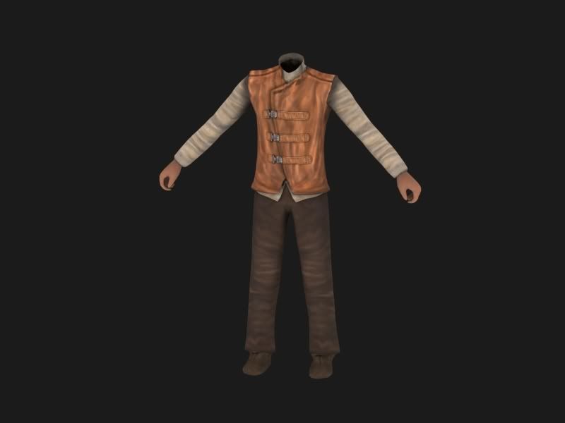
The face isn't there because the old one sucks
Edited by Master Windu, 04 October 2006 - 06:39 PM.
#128

Posted 04 October 2006 - 06:39 PM
Thanks, and I half agree with you on Eragon's shirt. It is tough leather, which is very tricky to do because it can either have very little folds or very many. I see what you mean, and I do agree with you a bit, but I dont see how I can get around it. It looks much worse with less folds. This is one of the pictures I used for reference:
http://image.com.com...7_screen007.jpg
Anyway, here's my updated version:
http://image.com.com...7_screen007.jpg
Why is the reference image you used and the updated version the same?
EDIT: I see you fixed it. Very nice
Edited by FlameGuard, 04 October 2006 - 06:40 PM.
#129

Posted 04 October 2006 - 06:41 PM
btw the hands need more texturing, or like shadows or something
Dmain | I-Cold | earthWhois
Dmain Now offers .mobi extensions....why? Because we can ![]()


Update: EAW Galaxy is almost ready for launch. We're currently in need of forum staff and content writers for the main site. Please PM or Email me ASAP.
BFME Fans if you think you have what it takes, bfmeworld.com would love to be built. I have neither the time, nor the motivation any longer...
#130

Posted 04 October 2006 - 06:50 PM
What do you mean, have a go at it? I didnt use the picture, I drew it all from scratchHmm, what DOES it look like with "less" folds. Because that pic you showed, while it looks nice. The jacket itself isnt actually that realistic imo. Why not have a go at it?
btw the hands need more texturing, or like shadows or something
Yeah, and the hands will get some work. It's really unfinished, I havent done the alpha or the bump map. (He's going to have an alpha channel on the end of his sleeves to make them frayed like the ref image).
I've found myself wanting to do more higher-poly stuff than the BFME poly limits. Its always fun to challenge myself at something new.
Oh, and FG, thanks for pointing that out.
#131

Posted 04 October 2006 - 06:53 PM
I've found myself wanting to do more higher-poly stuff than the BFME poly limits. Its always fun to challenge myself at something new.
Indeed it is
What do you mean, have a go at it? I didnt use the picture, I drew it all from scratch
lol i meant with less folds, like a more "clean" style, one that looks like its been ironed
LaurEDITa: Try to fix the quotes next time
Edited by Lauri, 06 October 2006 - 02:19 PM.
Dmain | I-Cold | earthWhois
Dmain Now offers .mobi extensions....why? Because we can ![]()


Update: EAW Galaxy is almost ready for launch. We're currently in need of forum staff and content writers for the main site. Please PM or Email me ASAP.
BFME Fans if you think you have what it takes, bfmeworld.com would love to be built. I have neither the time, nor the motivation any longer...
#132

Posted 24 October 2006 - 10:31 PM
EA's:
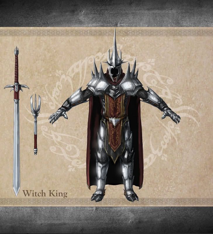
It might end up in a mod, i'm not sure yet. 4058 polies prior to optimization, so it would fit easily in BFME II.
Here's my work:
His button image:
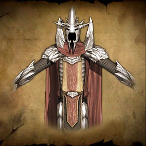
And the model/skin:
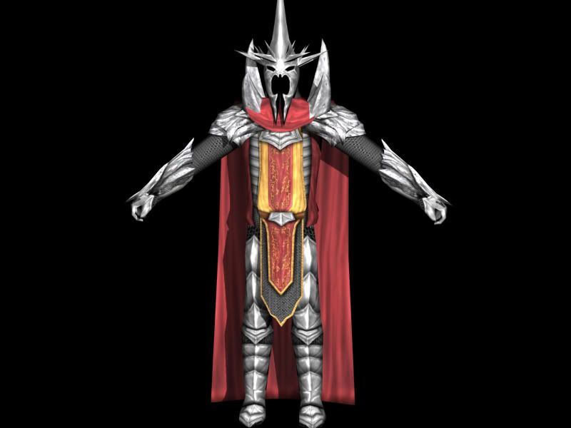
In the last image, it doesnt look that good because of the lighting, if i get a better render i'll post that too.
#134

Posted 24 October 2006 - 10:57 PM
Btw... is that a custom model?
Edited by FlameGuard, 24 October 2006 - 10:59 PM.
#136

Posted 25 October 2006 - 12:00 AM
-Hot!c3 II
#137

Posted 25 October 2006 - 12:07 AM
Aside from that, it's really an awesome achievement to get that done in a day.
Edit: I need to type faster
I also forgot to add: The better the skins, the more perfection is expected
Solinx
Edited by Solinx, 25 October 2006 - 12:09 AM.

"An expert is a man who has made all the mistakes which can be made in a very narrow field." - Niels Bohr
#138

Posted 25 October 2006 - 12:54 AM
Those models/skins are amazing work Windu, I can't believe how close those look to the concept art
-GothmogtheOrc
![]()
Click on my Sig to go to my BFME Modding site where you can download my mods.
Kings of the West Mod Leader
*Retired. PM me if you need to get a hold of me as I'll get an email notification and should reply within a day or so*
1 user(s) are reading this topic
0 members, 1 guests, 0 anonymous users


