Jump to content


Photo

Battlefield report.


  • Please log in to reply
29 replies to this topic

#1 Gamemate

Gamemate

    The former weird guy

  • Hosted
  • 1,443 posts
  • Location:Something with S
  • Projects:Drinking coffee
  •  Floating about

Posted 07 January 2007 - 06:36 PM

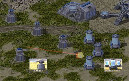
Commander, we have some sad news for you. UF has been developing a new kind of energy source, the power output is quite extensive for the size of the building and yet sturdy construction. We managed to sneak inside and set demo charges, the result is most interesting Commander, the explosion started an chain reaction and we were lucky to survive.

We lost one of our comrades, a new turret capable of detecting stealth spotted us and our cover was blown so we had to escape. Before we left the base we overheard UF engineers referring to it as Twin Blaster, be carefull. We do not know enough about the Blaster, details are needed before we assault the base.

Coorp intel out.
Posted Image
If people were more constructive with their comments, then this place would be more enjoyable
Posted Image
Posted Image

#2 Daz

Daz

    title available

  • Hosted
  • 2,654 posts
  •  Revora Co-Founder

Posted 07 January 2007 - 08:23 PM

Nice terrain, there are a few straight edged tiles at the bottom middle of the pic though :p

#3 Athena

Athena

    Embody the Truth

  • Undead
  • 6,946 posts
  •  Former Community Leader

Posted 07 January 2007 - 08:30 PM

Nice post and some nice looking structures there :p. Only bad thing I see is that fire angle but I am sure that will get fixed :p. Lovely cameos and terrain as well.

#4 Shine On

Shine On

    Resident Photographer

  • Hosted
  • 3,828 posts
  • Location:England
  •  Ex Cameo Maker and Modder

Posted 07 January 2007 - 08:59 PM

Cool work there GM :p Sharp work as usual :p
Posted Image

#5 Gamemate

Gamemate

    The former weird guy

  • Hosted
  • 1,443 posts
  • Location:Something with S
  • Projects:Drinking coffee
  •  Floating about

Posted 07 January 2007 - 09:12 PM

Terrain is still wip, those edges along with the water tiles will be fixed before next release. There is a bunch of other errors with the terrain as well, grass is tiling in a bad way so need to fix that as well. Fire offset will be fixed eventually.

Thanks for the comments :p
If people were more constructive with their comments, then this place would be more enjoyable
Posted Image
Posted Image

#6 Nemoricus

Nemoricus

    Dragon Awesomeness for the Win!

  • Project Team
  • 1,110 posts
  • Location:My cave
  • Projects:FC Alpha tester, Enigma Advisor

Posted 07 January 2007 - 10:06 PM

Cool work there GM :p Sharp work as usual :p

I second that. :p

If this is what the buildings are like, I can't wait to see the units.
Posted Image
Posted Image
Posted Image

#7 Jeeves

Jeeves

    I write the interwebz

  • Members
  • 4,156 posts
  •  Friendly neighborhood standards Nazi

Posted 08 January 2007 - 03:46 AM

Very, very nice. Think one of these is in order :p
Posted Image

World Domination Status: 2.7%


#8 Moon Pine

Moon Pine

    title available

  • Project Team
  • 351 posts
  • Location:Chinese Empire
  •  Zombie Summoner

Posted 08 January 2007 - 10:16 AM

Posted Image
:p Amazing :p
Posted Image
Soon Moon`s Minions will overnumber the enemy!

#9 Gosho

Gosho

    Go for it!

  • Members
  • 780 posts
  • Location:Sofia, Bulgaria
  • Projects:C&C Mahaira
  •  Doing something hideous, disturbing, anti-social

Posted 08 January 2007 - 02:02 PM

The only thing that's wrong (besides some of the WIP terrain tiles) is thePower Core cameo. It looks too boring and too pixelated for some reason...

#10 Speeder

Speeder

    #ControlMOre

  • Hosted
  • 9,002 posts
  • Location:Czechia
  • Projects:Mental Omega
  •  Mental Omega Creator

Posted 08 January 2007 - 02:06 PM

Shut you up, it looks pwnsome.

mainbanner.jpg
bt_left.pngbt_fb.pngbt_yt.pngbt_tw.pngbt_md.pngbt_right.png
115776.png


#11 Allied General

Allied General

    C&C Guild

  • Hosted
  • 6,922 posts
  • Location:United Kingdom
  • Projects:AGSA
  •  Modder

Posted 08 January 2007 - 02:30 PM

yet again gosho been smoking something, looks great, its also a different style gosho geez ...
Posted Image

#12 Gamemate

Gamemate

    The former weird guy

  • Hosted
  • 1,443 posts
  • Location:Something with S
  • Projects:Drinking coffee
  •  Floating about

Posted 08 January 2007 - 03:44 PM

The power core cameo is just as pixelated as the other cameos, besides it is bascilly a power plant, there is no action going on but flashing lights. It will stay this way unless there is more people that want it changed. I am listening to all the suggestions and critism, if there is a flaw it will be sorted.

Next update might be units since there has been indications that they might be of interest, note that this side will just have basic tanks and rest is mechs :D
If people were more constructive with their comments, then this place would be more enjoyable
Posted Image
Posted Image

#13 MaryJo

MaryJo

    The life, the Universe and Everything

  • Hosted
  • 522 posts
  • Location:Venezuela
  •  why does everyone has more posts than me? spamwhores!

Posted 08 January 2007 - 03:50 PM

This look nice! :D good work m8, this is getting dangerous ;)


#14 Gosho

Gosho

    Go for it!

  • Members
  • 780 posts
  • Location:Sofia, Bulgaria
  • Projects:C&C Mahaira
  •  Doing something hideous, disturbing, anti-social

Posted 08 January 2007 - 06:40 PM

They do look nice. I never said the opposite x_x I pointed out what's wrong, because you guys already said all the superlatives. I hate repeating people :D

yet again gosho been smoking something, looks great, its also a different style gosho geez ...

I smoke weed. What of it? :|
And that style I don't like. Like I said, it's just boring (the cameo, not the structure itself). You could move it just a bit back, remove one of the reactors and maybe not make it so straight forward, but then again, I'm one voice only.

#15 Gamemate

Gamemate

    The former weird guy

  • Hosted
  • 1,443 posts
  • Location:Something with S
  • Projects:Drinking coffee
  •  Floating about

Posted 08 January 2007 - 08:44 PM

I will make an alternative cameo, if that one is prefered over the current it will be used. See all fair :D

Done, I will leave the choice to you people ;)

Posted Image
If people were more constructive with their comments, then this place would be more enjoyable
Posted Image
Posted Image

#16 Allied General

Allied General

    C&C Guild

  • Hosted
  • 6,922 posts
  • Location:United Kingdom
  • Projects:AGSA
  •  Modder

Posted 08 January 2007 - 08:45 PM

2nd core design but 1st design +3 core layout :D
Posted Image

#17 need my speed

need my speed

    For Soviet people!

  • Hosted
  • 1,290 posts
  • Location:European Union (Magna Batavia)

Posted 09 January 2007 - 06:16 AM

Indeed, 2nd cameo is better but make it so that there are 3 Cores. :p
Please, if you see a mistake in my posts - spelling, grammar, punctuation, or whatever else - point it out. How can one learn from mistakes, if one is not corrected?
There is no wealth like knowledge, no poverty like ignorance.

#18 Nemoricus

Nemoricus

    Dragon Awesomeness for the Win!

  • Project Team
  • 1,110 posts
  • Location:My cave
  • Projects:FC Alpha tester, Enigma Advisor

Posted 09 January 2007 - 11:18 AM

I agree. Use the second design of cameo with the original's layout.

Nice work on GFX.

EDIT: You're including mechs? Sweet! I like mechs.

Edited by Nemoricus, 09 January 2007 - 08:28 PM.

Posted Image
Posted Image
Posted Image

#19 Gosho

Gosho

    Go for it!

  • Members
  • 780 posts
  • Location:Sofia, Bulgaria
  • Projects:C&C Mahaira
  •  Doing something hideous, disturbing, anti-social

Posted 09 January 2007 - 02:03 PM

Much better.

#20 OmegaBolt

OmegaBolt

    Lost In The New Real

  • Hosted
  • 6,273 posts
  • Location:London, England
  • Projects:Red-Resurrection
  •  O'Bolt

Posted 09 January 2007 - 03:11 PM

First cameo is best..

Posted Image

Posted ImagePosted ImagePosted ImagePosted Image


1 user(s) are reading this topic

0 members, 1 guests, 0 anonymous users