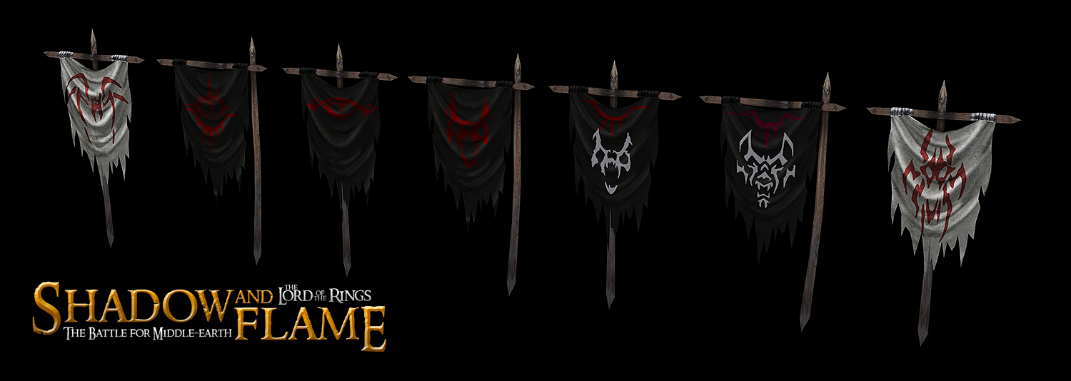
If this is blue, I really need to check my eyesight sometime soon ![]()
On the terms of brightness...

I disagree Val

Posted 22 August 2015 - 03:51 PM

If this is blue, I really need to check my eyesight sometime soon ![]()
On the terms of brightness...

I disagree Val
Posted 22 August 2015 - 04:45 PM
That's blue-y grey. I'm not saying that as a compromise, it's blue-y grey.
"Everyone's a hero when there's nowhere left to run."
- Auxiliary Skarn, 2333rd Cohort
Posted 22 August 2015 - 04:54 PM
That's grey. I'm not saying that as a compromise, it's gray.
Get you monitor set up properly. Of course, it might be my monitor, but why assume that I'm the one with the wrong settings when I can simply blame you?

The 4th Age version 0.8 has been released: Link
Posted 22 August 2015 - 05:01 PM
It will always be blue in my eyes. ![]()
Posted 23 August 2015 - 05:30 AM
Then you'll be one of the lucky few to play through Moria using one of the Blue Wizards.
Or, with some more changes to the monitor settings, with Radagst!

Posted 24 August 2015 - 07:45 AM
Shiny. Logo's a little meh though.
"Everyone's a hero when there's nowhere left to run."
- Auxiliary Skarn, 2333rd Cohort
Posted 24 August 2015 - 10:16 AM
Oh is it? Is it actually 'meh'?
Oh well. Everybody else liked it.
No fuel left for the pilgrims
Posted 24 August 2015 - 12:45 PM
The colour is nice but the layout is... at least for me, then, it's a little annoying.
"Everyone's a hero when there's nowhere left to run."
- Auxiliary Skarn, 2333rd Cohort
Posted 24 August 2015 - 01:19 PM
Here's a tip: when giving your opinion on things, use words other than 'meh' and 'annoying'. It's entirely unconstructive and meaningless, and it really annoys me.
Do you find the layout hard to read? Does it not catch your eye properly? Ok, those are things I can understand and relate to. I'll disagree, but at least we're having a conversation.
No fuel left for the pilgrims
Posted 24 August 2015 - 02:43 PM
Excellent Boromir model and skin!
One doe not simply make a perfect virtual Boromir!
I'm AragornIIElessar from moddb by the way ![]()
Posted 24 August 2015 - 02:45 PM
Hey man! Use your ModDB avatar on here so I recognize you quicker. ![]()
No fuel left for the pilgrims
Posted 24 August 2015 - 05:00 PM
Okay, fair point. More precisely, I dislike the way Shadow and Flame reads, because, though it's obviously not intended to be read as 'Shadow and the Lord of the Rings', it feels awkward to place it in that way. The logos which generally work best for sequels, additional content, mods, etc. are read line by line, because not only does that make it clear how to be read, it gives the logo a sense of organisation. The disjointed layout to me feels rather unprofessional.
But that is, as I think I inferred, my opinion. And apologies for my rather unhelpful strings of words above.
"Everyone's a hero when there's nowhere left to run."
- Auxiliary Skarn, 2333rd Cohort
Posted 24 August 2015 - 05:08 PM
https://www.twitch.tv/vileartist - Yes shameless self-promotion
----------------------------------------------------------------------------------------------------------------------
"Old modders never die, they just fade away" ~ Hostile
Posted 24 August 2015 - 10:13 PM
I like the logo ![]()
Posted 25 August 2015 - 05:21 PM

No fuel left for the pilgrims
Posted 25 August 2015 - 06:37 PM
I'll generally listen and possibly adapt when people that I know have artistic skill criticize my stuff, but this logo is something I feel very confident about.
Thanks for the compliment on the banners though. ![]()
No fuel left for the pilgrims
Posted 26 August 2015 - 11:11 PM

No fuel left for the pilgrims
0 members, 1 guests, 0 anonymous users