Jump to content


Photo

Unknown's attempted showcase


  • Please log in to reply
61 replies to this topic

#21 Unknown

Unknown

    title available

  • Hosted
  • 1,314 posts
  • Location:England
  • Projects:Work
  •  I changed

Posted 10 January 2012 - 01:19 PM

Here are cloaks belonging to the Men of Dunland on horseback:
The Dunland Chief is Pretty much the Banner Carrier ;)

Dunland Cloaks.jpg

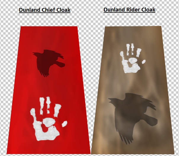
When I find more time, I will improve the cloaks and change the designs on them.

#22 Lauri

Lauri

    Old man Lauri

  • Hosted
  • 10,436 posts
  • Location:Norway
  • Projects:The 4th Age
  •  The very worst T3A Team Chamber Member

Posted 10 January 2012 - 01:44 PM

All cloth\cape stuff needs more folds I think (if that is the correct term). You know, like this;

Posted Image

Right now they're too static and flat.
And I think the crow design could be darker, and the separation between the wood boards on them could be thinner. You know, so the individual wood boards are closer to eachother. Now it looks like there's too much room between them (the black shadow lines).

The rust you tried to do, needs to be darker, and set to a multiply layer stance as Nertea's tutorial says. Or something to make a similar effect :p

The metal you've made is too clean, needs to be more crisp I'd say. And less silver bright, needs to be darker I reckon ;)

edit: a bit like this, see how the armour is more worn out, and not so clean.
Posted Image

Edited by Lauri, 10 January 2012 - 01:44 PM.

T4A_Logo_-_article.png

The 4th Age version 0.8 has been released: Link


#23 Unknown

Unknown

    title available

  • Hosted
  • 1,314 posts
  • Location:England
  • Projects:Work
  •  I changed

Posted 10 January 2012 - 01:50 PM

Thank you Lauri.
RG also said that most of the things were too clean such as the wood :p
How would I go about giving the armour a more crisp effect?
I will work on the cloth more but I personally think that cloth and leather need a lot of practice to get good at.
And do you have any idea how I could make the wood more dirty and old, as if it has had many battles before?
Thanks again Lauri :)

#24 Unknown

Unknown

    title available

  • Hosted
  • 1,314 posts
  • Location:England
  • Projects:Work
  •  I changed

Posted 10 January 2012 - 01:55 PM

Also Lauri, how can I improve this skin?
Dunland Banner.jpg

#25 Lauri

Lauri

    Old man Lauri

  • Hosted
  • 10,436 posts
  • Location:Norway
  • Projects:The 4th Age
  •  The very worst T3A Team Chamber Member

Posted 10 January 2012 - 08:58 PM

Folds :p And sharper wood, atm it looks like it's very blurry.

For more variety on both metal and wood, try some of the different brushes when you lighten and darken the thing a few times (to make more dents\scratches).
I'm terrible at explaining, but I hope you catch my drift :p

T4A_Logo_-_article.png

The 4th Age version 0.8 has been released: Link


#26 Unknown

Unknown

    title available

  • Hosted
  • 1,314 posts
  • Location:England
  • Projects:Work
  •  I changed

Posted 11 January 2012 - 07:35 AM

Thanks again Lauri,
I'll start playing around with more things ;)

#27 Unknown

Unknown

    title available

  • Hosted
  • 1,314 posts
  • Location:England
  • Projects:Work
  •  I changed

Posted 11 January 2012 - 12:12 PM

Seeing I have to make a new post when I use a new picture :p
I tried using different brushes, yes it looks crap ;)
New Dunland Shields.jpg

Could anyone maybe say what they think needs changing on the Original Dunland Shield (The one with the White hand on)

Edited by Unknown, 11 January 2012 - 12:13 PM.


#28 Unknown

Unknown

    title available

  • Hosted
  • 1,314 posts
  • Location:England
  • Projects:Work
  •  I changed

Posted 11 January 2012 - 12:22 PM

Sorry for loads of posts but I forgot to put this one on:
Dunland Pillager's Cloak and Torch..
Dunland Pillager.jpg
It's still a WIP (work in progress) but I just want to know if I'm on the right lines?

#29 Lauri

Lauri

    Old man Lauri

  • Hosted
  • 10,436 posts
  • Location:Norway
  • Projects:The 4th Age
  •  The very worst T3A Team Chamber Member

Posted 11 January 2012 - 01:53 PM

The right way, but maybe more folds, as a cloak can get pretty.... foldy.... :p And some variation in the size of the folds, so a bit more thin folds in there would be good I think.

I acctually like the crow better now, as it's more worn and the shield looks more used :) When you lighten and darken stuff, usually the best way is to set the "Range" to "Highlights", or atleast not "Shadows". "Shadows" will add grey skies if you highlights, and 'burn' the picture if darkening.

Again, let me know if you don't understand anything I'm saying :p

T4A_Logo_-_article.png

The 4th Age version 0.8 has been released: Link


#30 Unknown

Unknown

    title available

  • Hosted
  • 1,314 posts
  • Location:England
  • Projects:Work
  •  I changed

Posted 11 January 2012 - 01:59 PM

Thx again :p
I use the burn and dodge tool a lot and vary how much depth it uses and I toggle between highlights and I change the exposure a lot.
I still think the shield looks bad, do you think I should darken it or lighten it or add more effects on?
For the cloak, I'm still pretty bad at cloth materials and I'll learn with practice on what to do where :)
Thank you again :p

Edited by Unknown, 11 January 2012 - 01:59 PM.


#31 Lauri

Lauri

    Old man Lauri

  • Hosted
  • 10,436 posts
  • Location:Norway
  • Projects:The 4th Age
  •  The very worst T3A Team Chamber Member

Posted 11 January 2012 - 02:37 PM

The shield could be darker, but doesn't have to.. But darker and more saturated perhaps? (not it's a bit on the colour-less side maybe..)

T4A_Logo_-_article.png

The 4th Age version 0.8 has been released: Link


#32 Unknown

Unknown

    title available

  • Hosted
  • 1,314 posts
  • Location:England
  • Projects:Work
  •  I changed

Posted 12 January 2012 - 08:11 AM

But darker and more saturated perhaps? (not it's a bit on the colour-less side maybe..)

Okay, here it is:
I put both down so people can compare the two ;)
Old:
New Dunland Shields.jpg

New:
New Dunland Shields 2.jpg

#33 Unknown

Unknown

    title available

  • Hosted
  • 1,314 posts
  • Location:England
  • Projects:Work
  •  I changed

Posted 12 January 2012 - 08:14 AM

I just found this lying around:
I made it about a month ago :p
Lighter.jpg

#34 Unknown

Unknown

    title available

  • Hosted
  • 1,314 posts
  • Location:England
  • Projects:Work
  •  I changed

Posted 12 January 2012 - 09:05 AM

Just did these 2:
New Dunland Shields 3.jpg

#35 Bashkuga

Bashkuga

    Because good guys are too mainstream

  • Project Team
  • 2,039 posts
  • Location:On my way to besiege Minas Tirith
  • Projects:Age of the Ring Betatester and Mapper, Edain Mod Betatester
  •  Out of the frying pan, and into the fire..

Posted 12 January 2012 - 03:14 PM

Looks good :)

#36 Lauri

Lauri

    Old man Lauri

  • Hosted
  • 10,436 posts
  • Location:Norway
  • Projects:The 4th Age
  •  The very worst T3A Team Chamber Member

Posted 12 January 2012 - 05:29 PM

There's too much gray on them... Do you lighten the shields with the Range set to Shadows? That's the wrong one at any rate :p

Unless you can explain the gray stuff..

T4A_Logo_-_article.png

The 4th Age version 0.8 has been released: Link


#37 Unknown

Unknown

    title available

  • Hosted
  • 1,314 posts
  • Location:England
  • Projects:Work
  •  I changed

Posted 13 January 2012 - 06:43 AM

Oh, these were completely new ones (from scratch) :p
I never set the range to shadows... ever :thumbsdownsmiley:
I think I desaturated it too much so maybe I could saturate them a bit?

Oh, sorry, I see what gray stuff you mean.
I used the paint tool to add it on and desaturated it and did work on it to make it look more used and mouldy :p

Oh, and thank you Fredius :)

Edited by Unknown, 13 January 2012 - 06:48 AM.


#38 Unknown

Unknown

    title available

  • Hosted
  • 1,314 posts
  • Location:England
  • Projects:Work
  •  I changed

Posted 13 January 2012 - 08:55 AM

Here is my own skin but the original model:
I UVW Mapped it myself (was annoying) but it is my first ever UVW Map ;)
Saruman Staff.jpg

#39 luh-koala

luh-koala

    Marsupilartist.

  • Project Team
  • 115 posts
  • Location:PR Beach - Brazil
  • Projects:FB2G
  •  Nothing is true.Everything.is.permited.

Posted 13 January 2012 - 03:08 PM

Here is my own skin but the original model:
I UVW Mapped it myself (was annoying) but it is my first ever UVW Map ;)
Saruman Staff.jpg


Nice work, man, lovely drawing^^

Looks pretty nice ^^ Why u dont try to add some reflections? im supposed u're using PS, right?
The stone in the top of the staff, looks a bit dead.. (probably the FX will handle it a bit, right?

Also, dont fear to add some details^^ the default shapes are always yr friend =)

The idea with the diamond was perfect.. just remember that light brights more then just at him =D

Also, you forgot the 3D borders of the palantir metal head in the perspectives..^^

Well, to exemplify what im saying:

Posted Image
Posted ImagePosted Image

#40 Unknown

Unknown

    title available

  • Hosted
  • 1,314 posts
  • Location:England
  • Projects:Work
  •  I changed

Posted 13 January 2012 - 06:20 PM

First I have to say, you did an amazing picture there :thumbsuphappy:
Also, I'm gonna put more time into it and eventually I'm gonna re-do it and make it look more realistic.
And thank you for the advice :)
I'll try and get a look more like this:
Posted Image

-The ball is round and has that moony look to it
-The material of the staff is marble like to me, smooth and a lot of light reflecting from it

Edited by Unknown, 13 January 2012 - 06:22 PM.


0 user(s) are reading this topic

0 members, 0 guests, 0 anonymous users