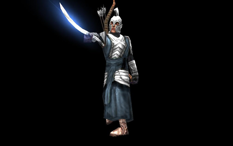
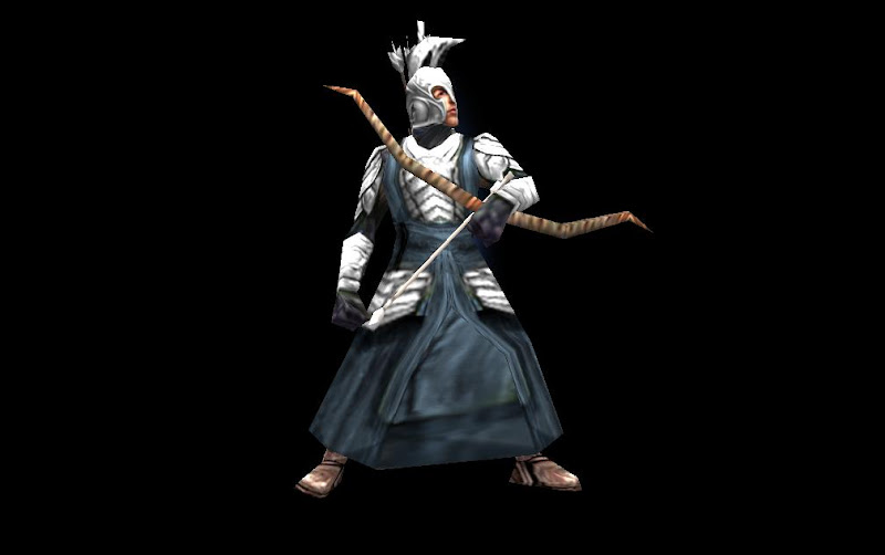
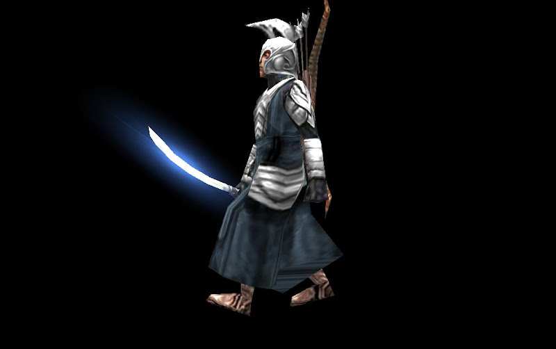
Hehehe, Yea Its inspiring XD.

Rider of Rohan's Stuff
#42

Posted 11 March 2013 - 10:47 PM
Lol just thought this post up in here :
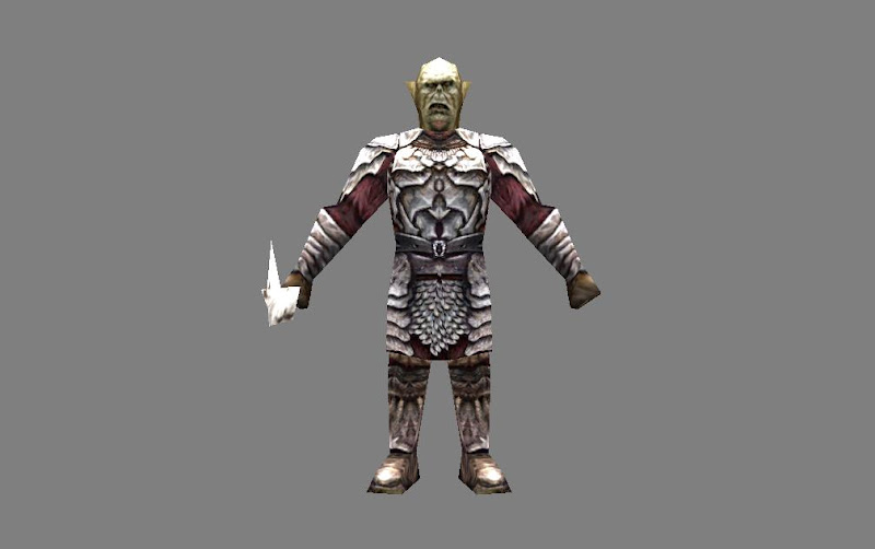
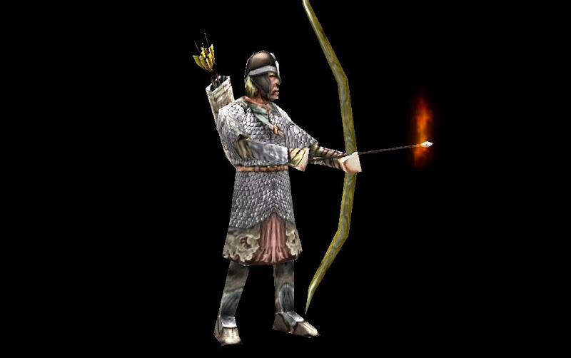
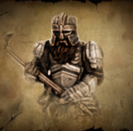
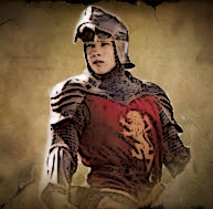
The Helm for the Archer was from one of the Textures used for Mathijs's Edoras Spearmen
And the Orc Brute had some stuff taken from Gothmog ![]()
Edited by Rider of Rohan, 11 March 2013 - 10:50 PM.
#44

Posted 14 March 2013 - 11:53 PM
Use more textures on both maps. ![]() the layouts looks OK though.
the layouts looks OK though. ![]()
#45

Posted 15 March 2013 - 02:46 AM
I will give my tips directly:
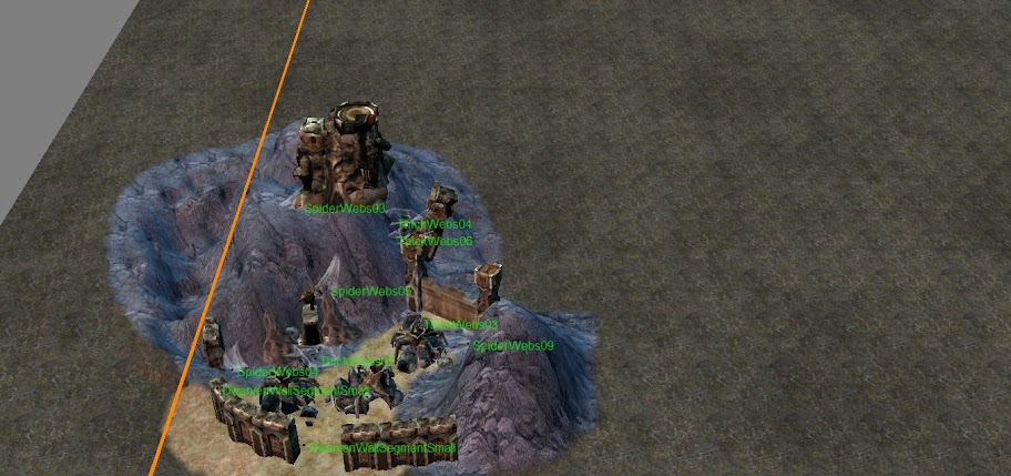
- Make sure there is space for players to move around, the Dwarf picture looks a bit cramped.
- Also make sure your players are focused away from the edge of the map. The Dwarf picture again is too close to the edge, if it is hardly any detail worthy of being nearer to the centre then it is okay, but I am going to recommend copying it and putting it a bit closer so you can "hide" the edge with a mountain or something. Keeping the player away from the edge of the map (but not forcing them to the centre of course, lol) makes the map seem bigger, even though you lose a little bit of space to an impassable area, of course scripted maps need paths leading in.
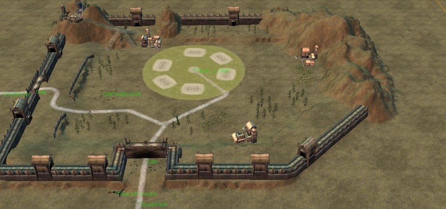
- It looks like you have used Dwarf postern gates? Other players won't be able to see them and/or they will be flashing to invisible, unless you can script/code/ini something in. I don't know exactly how it works.
Remember that all worlds draw to an end and that noble death is a treasure which no one is too poor to buy. - C.S. Lewis
There will come a time when you believe everything is finished. That will be the beginning. - Louis L'Amour
What will matter then will be people. If relationships will matter most then, shouldn't they matter most now? - Max Lucado
#46

Posted 15 March 2013 - 02:48 AM
#48

Posted 15 March 2013 - 07:01 PM
Well the ruined fortress is just an eye-opener for the map, not to be player related just a place where a ton of spiders can be found and overtaken for money XP. It's supposed to be a forgotten forest but i don't think it will fit in in middle earth but i could still try at it XP.
The Rohan fortress uses the old (BFME 1) castle walls so it's not scaled, Yea they need to be textured I'll take a look at Haldir's guide(s) to mapping later on. And the castle floor object i saw it didn't really cut when i played in the map, also i forgot to fix up the walls to be stronger (._.) 1 hit wonders they were.
#49

Posted 15 March 2013 - 07:30 PM
Great start, everything tends to be choppy at first, but the point is having the drive to improve. Every attempt will be better then the last even if it doesn't look like it, the point is you're learning.
Keep going, and great things will follow. ![]()
https://www.twitch.tv/vileartist - Yes shameless self-promotion
----------------------------------------------------------------------------------------------------------------------
"Old modders never die, they just fade away" ~ Hostile
#51

Posted 20 March 2013 - 11:13 PM
So I was kinda bored today, and came up with a Nazgul Bust, from scratch ![]() . It's unfinished and un-textured but i think right now it's worth getting some advice XP
. It's unfinished and un-textured but i think right now it's worth getting some advice XP
Side

Side Back

Front
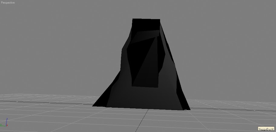
^----------------------- It looks better from the side ._. doesn't it XD
Edited by Rider of Rohan, 20 March 2013 - 11:15 PM.
#52

Posted 25 March 2013 - 06:13 PM
#54

Posted 25 March 2013 - 10:50 PM
To my knowledge at least two have been attempted over the years but none ever got too far.
I quite like the layout of that Rohan base, can you get men on the walls though?
#57

Posted 26 March 2013 - 02:46 AM
To fast. Way to fast. The only thing that didn't feel out of place was the slow-motion sequence with Merry and Eowyn in the start. You have to follow the rythm, not the lyrics.
Just my cents.
- Rider of Rohan likes this

The 4th Age version 0.8 has been released: Link
#60

Posted 27 March 2013 - 07:56 PM
The editing looked pretty solid to me. The song it was tailored to, however, was awful.
- Rider of Rohan likes this
No fuel left for the pilgrims
1 user(s) are reading this topic
0 members, 1 guests, 0 anonymous users


