Thanks for the feedback Mathijs,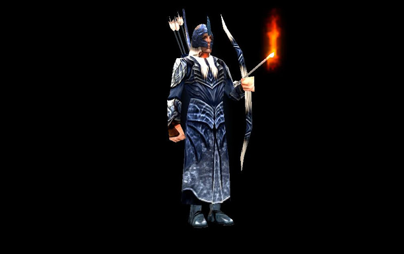


Posted 28 March 2013 - 05:07 PM
My opinions: (As a relatively well-known Galadhrim nut)
Get rid of the freakin' blue version. It's a total joke, only made by EA and looks silly. Do a Marchwarden concept (the grey cloaked elves in Lothlorien you see in FOTR)
Also, the helmet it very poor that you have there. While I can see that the design is pretty accurate, the positioning is way off. You can see in the following images that the helmet will not come past the cheekbone, while yours goes all the way to the edge of the lips.
http://farm5.static...._a8a7289c93.jpg
http://home.comcast...._SnowLass63.jpg
I'd like to say good job, but it's just an EA rehash from Haldir's armour to a Galadhrim. I would like to see more creativity.
Don't be afraid to explore your boundaries. Follow concept images and try to re-create things instead of just up the resolution.
I'm pleased with the progress though, but just remember to still be ambitious. Nothing is hard, once you've tried it enough times.
https://www.twitch.tv/vileartist - Yes shameless self-promotion
----------------------------------------------------------------------------------------------------------------------
"Old modders never die, they just fade away" ~ Hostile
Posted 28 March 2013 - 05:51 PM
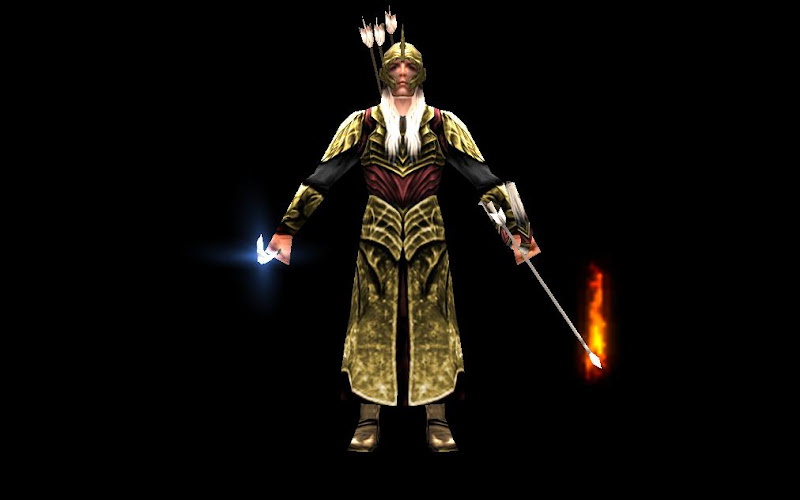
Thanks, your points have been taken into consideration, Helm detail toke forever to get right, I spaced it out a bit so you can see the lip, also noticed his sleeves are black, but I don't know how Imma make him Marchwardenish...... with the cloak and all.

Posted 28 March 2013 - 06:39 PM
The easiest way is to go on google and look up fabric references, then remake the texture with a grey-fabric look. Also you can try and reference some of EA's skins that are fabric based, but that is not as ideal since it's still an example of "EA rehash" as I stated before. I tell you you'll get more respect for being unique. ![]()
https://www.twitch.tv/vileartist - Yes shameless self-promotion
----------------------------------------------------------------------------------------------------------------------
"Old modders never die, they just fade away" ~ Hostile
Posted 28 March 2013 - 09:54 PM
That's the stuff, fantastic. Can I ask what your reference was?
https://www.twitch.tv/vileartist - Yes shameless self-promotion
----------------------------------------------------------------------------------------------------------------------
"Old modders never die, they just fade away" ~ Hostile
Posted 28 March 2013 - 10:07 PM
Well there a alot ! but the important ones are :
(Face's main structure)
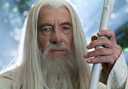
(Belt)

(main for vest, helped with detail for the arm sleeves and upper & lower part of the ... skirt thingy)


And you've guessed it there was loads of dodging and burning on the clothes !!! I also have downloaded the ROTK Gandalf model which i could really only use as reference becuase the textures are in like really low quality ( 128 x 128, highest being 256 x 256 ), this texture is 512x 512 so i couldn't get it to do anything because of the major loss in quality.
Edited by Rider of Rohan, 28 March 2013 - 10:12 PM.
Posted 29 March 2013 - 02:21 AM
Lol so i just re-watched the Haldir arrives moment like 5 times and then realized how hard this might be, and then noticed them Rohirrim soldiers/militia and was like dayum .... that is some (uniquely) hard armor imma have to do sooner or later ._. But for starters i just kept this one simple :

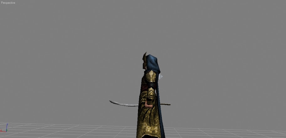
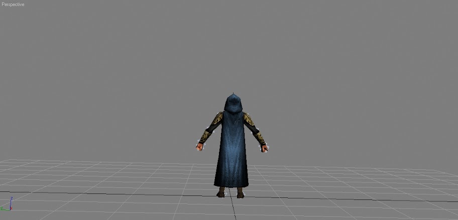
Phew, that's enough max for one day !
Edited by Rider of Rohan, 29 March 2013 - 02:25 AM.
Posted 29 March 2013 - 05:55 PM
Gandalf is almost done, just need to do dem hands and the scabbard. Do know i did try to get the staff as accurate as possible, EA's mapping techniques were a bit frustrating I mean the staff and the sword use the same part of the texture, although the sword looks like it has orc blood on it ![]()
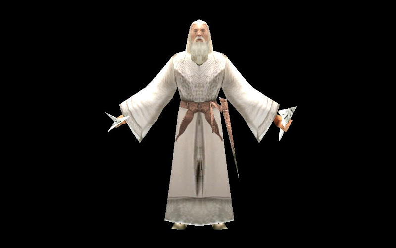
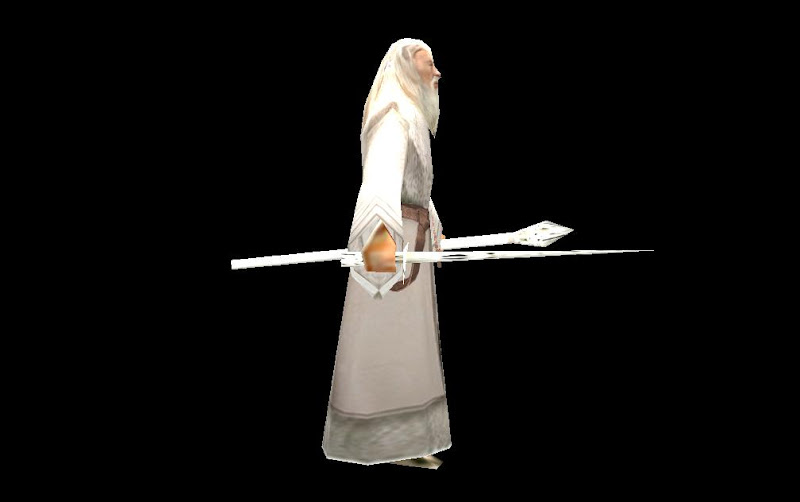
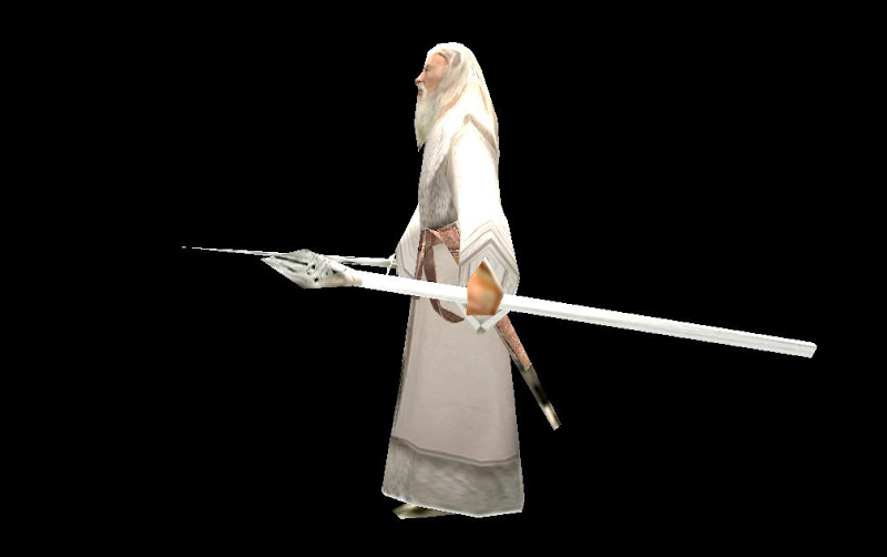
Posted 29 March 2013 - 07:03 PM
Well, I would recommend that you make a new, separate texture for the scabbard, sword and staff. And preferably make a new sword at least. Then map the things to your liking, and voila; much better! I seldom have 1 texture for a unit.

The 4th Age version 0.8 has been released: Link
Posted 29 March 2013 - 11:25 PM
Hehe.. Lookin good ![]()
Posted 30 March 2013 - 07:12 AM
Looks a helluvalot better than EA's, that's for sure.
"Everyone's a hero when there's nowhere left to run."
- Auxiliary Skarn, 2333rd Cohort
Posted 30 March 2013 - 06:16 PM
All looks good but going back to the galad's the cloak also reaches across the entire shoulder length. dont just wrap it around the neck. Also, the bottom of the hood should be more towards the front of the neck not the back. Maybe make the fin a little thinner or whatever so the hood is more on his head and not dangling from the back like hes getto or something. lol
Posted 30 March 2013 - 07:32 PM
Thanks Guys, And i tried to keep the cape simple for now, later on I'll worry about that XP. I have some Horse Lords stuff to get to and then continue with these ( I have the Peasants to fix up and then the Shield-Maidens ).
0 members, 2 guests, 0 anonymous users