![]() Oh,it's like in Red Alert 3
Oh,it's like in Red Alert 3


Posted 08 September 2013 - 03:20 PM
Exactly what I was thinking Ruudy!

Posted 08 September 2013 - 10:00 PM
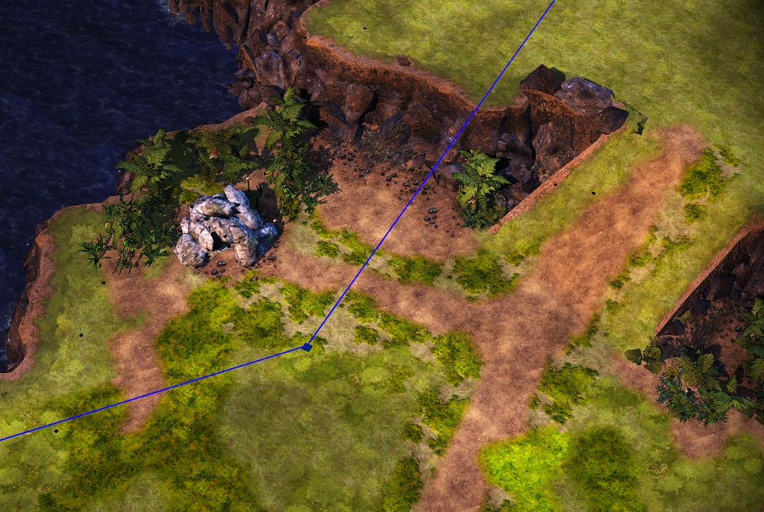
So Ruddy have you dabbled in mapping before? I ask simply because the quality of work is impressive. The cliffs remind me personally of AOE III which only had cliffs like the ones in your map above.
Posted 09 September 2013 - 06:42 AM
Yes it also reminds me of Age of Empires III, it certainly is the easiest way of making nice looking cliffs (it also misses out on texture stretching).
Remember that all worlds draw to an end and that noble death is a treasure which no one is too poor to buy. - C.S. Lewis
There will come a time when you believe everything is finished. That will be the beginning. - Louis L'Amour
What will matter then will be people. If relationships will matter most then, shouldn't they matter most now? - Max Lucado
Posted 09 September 2013 - 12:51 PM
So Ruddy have you dabbled in mapping before? I ask simply because the quality of work is impressive. The cliffs remind me personally of AOE III which only had cliffs like the ones in your map above.
Yes, I made some maps for bfme2 an i know how to work with WB. Thanks for comments)
Posted 09 September 2013 - 07:33 PM
Yeah, that camera angle's much nicer ![]()
Nah, you're right, the more contrasting sun gives a nice jungle-y feel, which I like.
"Everyone's a hero when there's nowhere left to run."
- Auxiliary Skarn, 2333rd Cohort
Posted 10 September 2013 - 08:37 AM
Yeah, that camera angle's much nicer
Nah, you're right, the more contrasting sun gives a nice jungle-y feel, which I like.
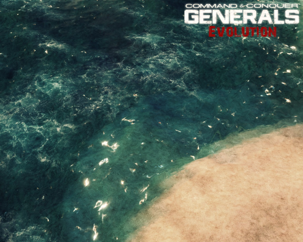
we improved a game engine a bit. now bfme looks like red alert 3.
now we are working on water. hope to see result like this:

Posted 10 September 2013 - 12:55 PM
So out of curiosity how does one "improve the game engine". Could you give some more details on this.
Posted 16 September 2013 - 11:42 AM
I'm finding it hard to find anything bad about the texture at all. The only thing I do not care for is the high contrast between the side of the wall and the top part. It looks a bit odd to have the top part look almost white, with the side being much more dark. But that is a minor thing, and only opinion based.
https://www.twitch.tv/vileartist - Yes shameless self-promotion
----------------------------------------------------------------------------------------------------------------------
"Old modders never die, they just fade away" ~ Hostile
Posted 16 September 2013 - 11:49 AM
Can you put 3 segments(connected) next to each other to see what it looks like?
Ps. How many gigabytes will this project consist off ![]()
Edited by THORONGlL, 16 September 2013 - 11:50 AM.
Posted 16 September 2013 - 12:22 PM
As it is geared towards a HD mod - I am hoping for a couple of extra GBs in this mod. =D
P.S. I will recommend three things from the vanilla Gondor wall:
Edited by MattTheLegoman, 16 September 2013 - 12:30 PM.
Remember that all worlds draw to an end and that noble death is a treasure which no one is too poor to buy. - C.S. Lewis
There will come a time when you believe everything is finished. That will be the beginning. - Louis L'Amour
What will matter then will be people. If relationships will matter most then, shouldn't they matter most now? - Max Lucado
Posted 16 September 2013 - 12:39 PM
As it is geared towards a HD mod - I am hoping for a couple of extra GBs in this mod. =D
P.S. I will recommend three things from the vanilla Gondor wall:
- Castellations - like the split oval shaped ones on the walls of Minas Tirith
- Pillars
- Carved decorations on the walls and floor
It was started as HD mod=) Now it's more interesting project.
Can you put 3 segments(connected) next to each other to see what it looks like?
Ps. How many gigabytes will this project consist off
As you wish =)

PS:Oh, now it's about 100-150 mb. We are working only on Gondor now =)
I'm finding it hard to find anything bad about the texture at all. The only thing I do not care for is the high contrast between the side of the wall and the top part. It looks a bit odd to have the top part look almost white, with the side being much more dark. But that is a minor thing, and only opinion based.
Thanks for comment!
Edited by Ruudy, 16 September 2013 - 12:39 PM.
Posted 16 September 2013 - 02:12 PM
The wall texture is seamless as it should which you nailed like a pro ![]() .
.
Perhaps you can scale down the stones "tiles" on top of the wall which in my mind would make the walls seem bigger.
So this is the wall without the upgrade I presume. So you'll have to make an even more fancier version ![]()
Perhaps you could play around with the 'house colored' flags on the wall.
If you plan on simply disabling the house colors as lots of modders do, I think its an big mistake gameplay wise.
Posted 16 September 2013 - 04:09 PM
Perfectly executed, as ever. How you manage flawlessness in such simplicity is a mystery.
"Everyone's a hero when there's nowhere left to run."
- Auxiliary Skarn, 2333rd Cohort
Posted 16 September 2013 - 09:16 PM
nice work, with relation to the size of the wall. is higher than the normal wall gondor?
Posted 17 September 2013 - 08:54 AM
took me 3 seconds, and I spotted the divides, Like a pro.
Looks really good tho, wouldn't hurt to have some extra trimmings on the mesh to help blend the parts together by distracting the viewer with detail
Edited by DIGI_Byte, 17 September 2013 - 08:57 AM.

RIP 2323
0 members, 0 guests, 0 anonymous users